
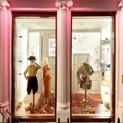
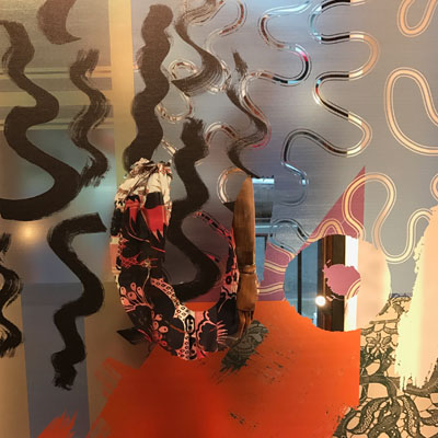
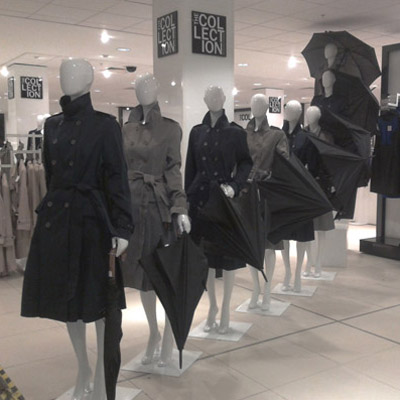
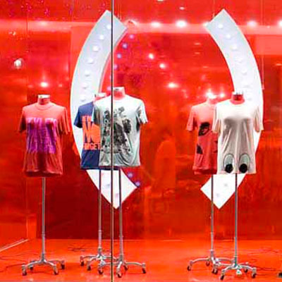
Vivienne Westwood 2014 - 2017
> words
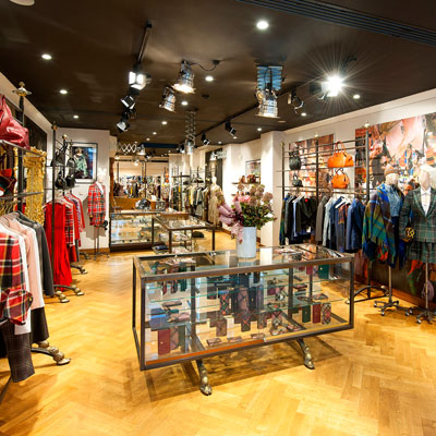
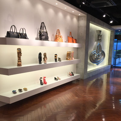
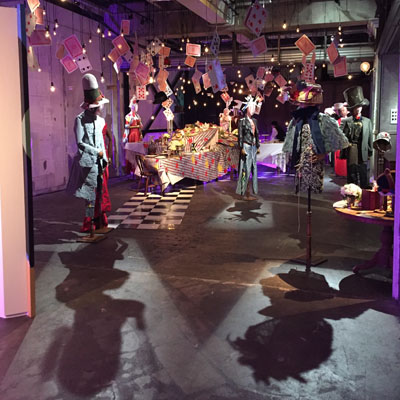
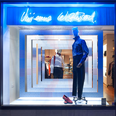
Although Vivienne Westwood sits amongst the realms of luxury, the transition and overall principles from my previous roles within High Street/Premium Brands formed a strong basis for the Visual changes that I felt were necessary. How to maintain a boutique feel with a commercial presence was a challenge that took some time to implement particularly with the range in price of the product and across Global Markets. Although the images shown here relate to the Creative Window schemes as part of my Visual Manager role at Vivienne Westwood, my main objective was to bring a clear identity to the brand, not only in the windows, but in store with the product displays, across online/digital platforms, marketing and events creating a coherent message for the customer to relate to. This was a lesson in story telling, building on the inspiration of each Season’s Collections, a diverse mix of art, history and current political messaging.
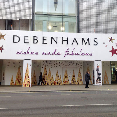
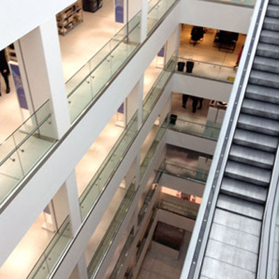
Debenhams 2014
> words
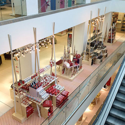
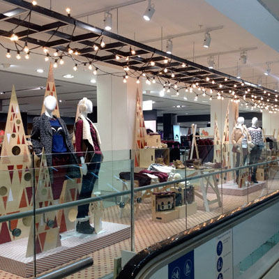
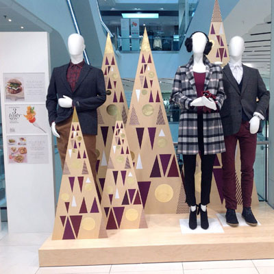
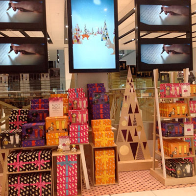
Debenhams had almost completed the rebuild of its department store on Oxford St London when I was appointed Senior Creative Manager. This was a job of considerable scale at a very crucial time in Debenhams long history. I was really looking forward to the challenge of helping this heritage brand evolve into the twenty-first century, following in the footsteps of numerous other heritage brands that had recently made the transition to luxury or premium markets. My first install shattered any beliefs I had in the value Debenhams placed on its own heritage. Budgets were wafer thin and spaces had to be coherently held together with little more than print. Anything vaguely artistic like the Muybridge install below was dropped. The Debenhams leadership wanted to create a Walmart on Oxford St in a battle of ever diminishing margins. The images below show what can be done with wrapping paper and very little else. It’s a huge store and the large spaces need sales coherence and the team did its best. Scale and heritage were the draws to Debenhams but with its leadership pulling in the opposite direction as a discount store Debenhams was a sad disappointment and not for me.
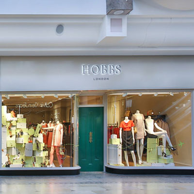
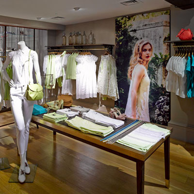
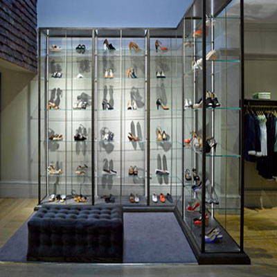
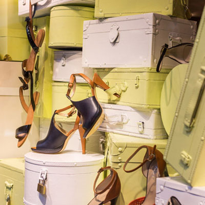
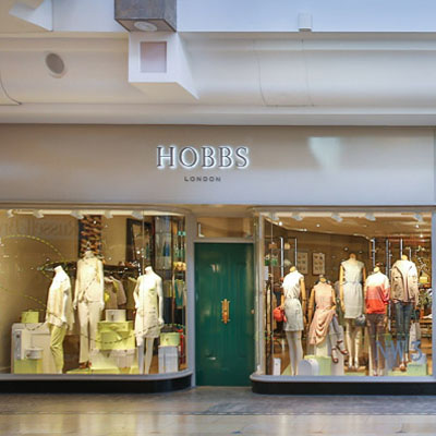
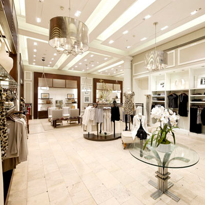
Hobbs 2013
> words
Hobbs is another premium Brand where the sales approach is best described as domestic bliss. Hobbs sells combinations in domestically scaled spaces. The spaces are more intimate and less formal than that of BR. Store props and window displays reflect this approach.
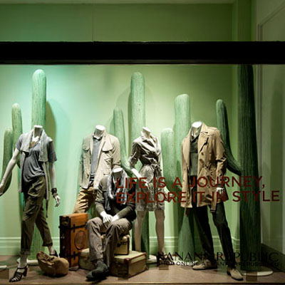
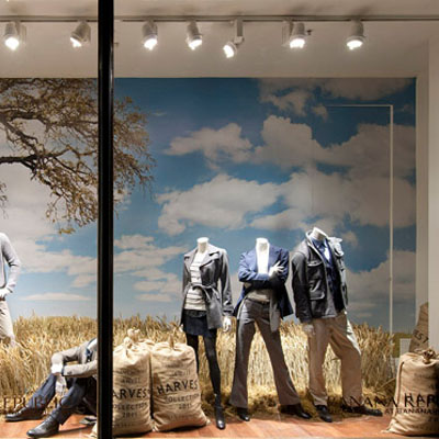
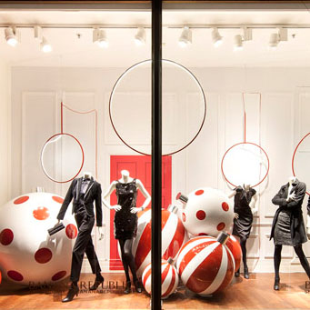
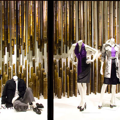
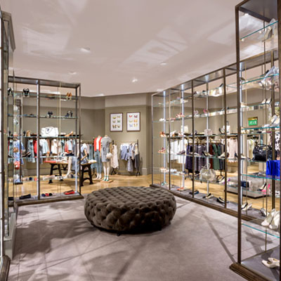
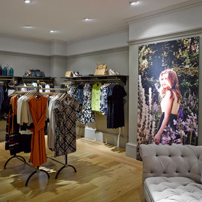
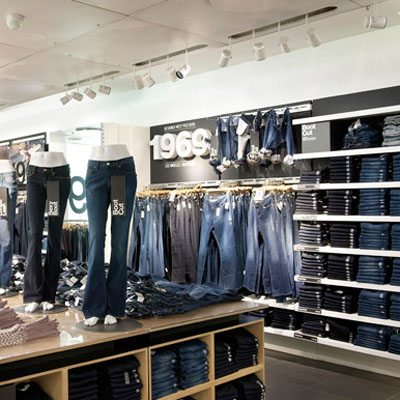
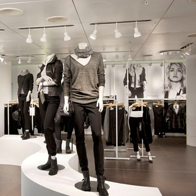
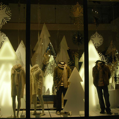
Banana Republic 2009-13
> words
The primary difference that determines the relative organisation of the premium brand Banana Republic to Gap Inc is time. The pace of shopping in a BR store is much slower than at GAP and the spaces are organised accordingly. BR sells combinations and sales assistants are part of the selling philosophy. Spaces are organised as interlinked salons where each salon is subtly themed to sell a particular combination. The spaces are clearly defined, professional and sophisticated. The window installations reflect this approach.
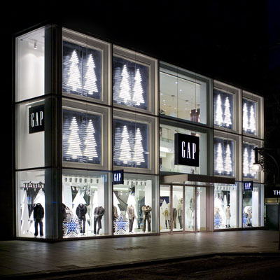
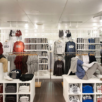
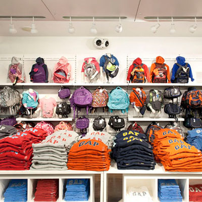
GAP Inc 2007-09
> words
A large multi-national high street chain was a considerable change from my previous employment. My work to date was exclusive, limited edition prints and one off installations. The change in scale that Gap Inc facilitated allowed many more three-dimensional as opposed to two-dimensional opportunities, all be it within a very restricted pallet.
GAP Inc sells in quantity. Quantity has an aesthetic derived from the organisation of batching, grouping, collation and proximity. Spatially this makes a rich tapestry of fabric and colour that appears at first chaotic but is highly logistic and considered. The challenge at Gap Inc was to deliver aesthetically appealing spaces out of this tapestry whilst enhancing sales through overall organisational clarity and locally with proximity, incitation, impulsion and associative purchases. Clear zoning, grouping and speed of sales are intrinsic to this brand.
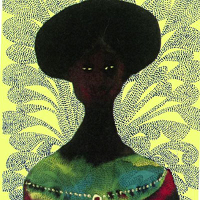

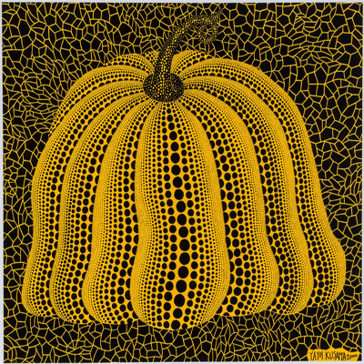


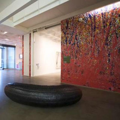
Omni 2000-07
> words
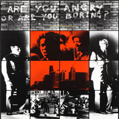
The work at Omni was the foundation for all that followed. Whilst learning the technical side of print and presentation I had access to a whole new network of artists and designers, including, Gilbert & George, Takashi Murakami, Yayoi Kusama, Antony Gormley, Michael Craig Martin, Damien Hirst, Chris Ofili, Peter Blake, Gary Hume, Zaha Hadid, Galleries included Whitechapel, Serpentine and Victoria Miro. This was the production side of display with the main work being for galleries and retail.
Images left to right – 1 Chris Ofilli, 2 Takashi Murakami, 3 Yayoi Kusama, 4 Antony Gormley, 5 Rachel Feinstein & John Currin, 6 Angus Fairhurst, 7 Gilbert & George,