071017 – Space Port Venice – London
> words
Venice is a surreal island, a level plateau built on mud enshrouded by its lagoon. The Grand Canal, a truncated ‘river’ that starts and finishes as if cut from the mid section of another river from a distant land. The lagoon shelters the island. Venice is an island protected by spits and shallow mudflats and throughout its history these have foiled many a sea-based invasion, leaving antagonistic armies stranded in the shallows. Venice was originally little more than a swamp, a site chosen by the dispossessed and victimised, a marshland where its residents could reside in safety and start anew.
Early Venetian dwellings were little more than wooden huts on stilts clinging to the highest silt banks, an environment with poor natural resources, no farmland, few trees just marshes, reeds and bogs. Locally the residents could fish for crab, shrimp and silt dwelling fish. With stifling hot summers and brutally cold winters the original occupants were survivors, there to avoid persecution but also there to search out a better life, to start afresh without landlord or feudal lord. Soon they would learn to navigate their lagoon and become fishermen trading the surplus for what they needed. As their confidence grew they would venture further out into the Adriatic Sea trading along the coast of what is now Italy, Slovenia and Croatia. A natural progression to trading fish for goods or money was then to trade on the goods bought, so up and down the coasts they would travel buying and selling. With this the Venetians found wealth, their wooden huts soon replaced by large wooden buildings. Larger ships were built to carry more goods and to travel greater distances. As their success grew new inhabitants were attracted to their island home and soon it was full on its way to becoming a city.
The larger ships carried the Venetians south down the Adriatic hugging the Albanian coast to Greece, here they would turn east eventually to reach Constantinople to trade with the Turkish traders at one end of the Silk Road. When Marco Polo returned to Venice after 24 years of travels to the East, his stories told of the huge wealth of the orient merchants who were keen for this new trade. The Silk Road travelled from China to Constantinople and the Venetians controlled all water born trade from Constantinople to the West via Venice. The areas around the Rialto developed into a market where all types of exotic goods could be bought and sold. Ships from Constantinople would harbour in the mouth of the Grand Canal and unload here at sea. Narrow boats took the goods from the ships along the network of canals and into the merchant’s houses. Venice was a port, a distribution and logistics centre but a centre like no others. The Venetian merchants houses developed into a unique type of wholesalers. Water gates at the base of the buildings open onto the canals allowing boats to access, unload and sell their wares. Floors immediately above this were storage and sales spaces. Floors above the sales spaces were domestic living accommodation. These were family businesses and the families grew very wealthy expressing their wealth in forever finer buildings. Early banking and insurance began here to aid the merchants and the infrastructure of trade developed. The Venetians were wise enough to appreciate that although their interests were personal their strength was as a collective so their ‘port’ was soon adorned with large pubic squares, churches, bridges, sculptures and monuments.
The trade routes along the Silk Road picked up ‘travellers, adventurers, explorers, rogues and vagabonds’. Service industries sprung up along route, food stalls, bars, theatres, gambling dens, dancers, faith healers, barbers, costumers, mercenaries, body guards, assassins, prostitutes, and at its terminus Venice soaked up this huge influx of cross cultural immigration that supplied these services. Intercontinental trade needs liberal conditions, in Venice, Christians, Moors, Asians and Jews all added to the mix. Their streets and their buildings an endless collage of cross pollination, an exquisite assemblage of adoption and adaption.
When travelling considerable distances and when trade is exposed to substantial risk the best goods to ply have high value, low baulk. So trades in spices, gold, precious jewels, silks, perfumes and porcelain dominate. These suit the caravans of the land route, the rowed and square sailed ships of the sea route, the souks, bazaars and markets and the merchants houses of Venice.
The first privateers to venture into space will be looking for goods to trade. Asteroid mining will probably be one of the early businesses to be established. Small towns, space shanties, will settle on the asteroids they are mining and with time these settlements will grow attracting the many subsidiary industries that feed upon a primary industry. Not unlike the growth of Venice the asteroid towns will soon attract ‘travellers, adventurers, explorers, rogues and vagabonds’ all looking to get rich quick, to escape the established regime, to seek out a new life.
Billions of years ago asteroids and planets were accreted from the same starting materials. The stronger gravitational force generated by a planet pulled all siderophilic (iron-loving) elements into their cores during the stages of their molten youths, leaving the surface crusts depleted of such materials. On earth asteroid impacts have re-infused the surface crust with these valuable elements. Typically these include metals such as gold, cobalt, iron, manganese, molybdenum, nickel, osmium, palladium, platinum, rhenium, rhodium, ruthenium and tungsten all with considerable economic and technological value. On asteroids due to their lack of sufficient mass and gravitational pull these elements may often be found lying on or near the surface, easing their discovery and recovery. Of these asteroids there are several Easily Recoverable Objects (ERO’s) and Near Earth Objects (NEO’s) that could feasibly be reached and mined.
Asteroids are categorized by their spectra into Types. C-Type asteroids have a high abundance in ice and therefore these asteroids would have a significant infrastructure role in space. C-Type asteroids would be logical bases on which to set up space depots to provide, water, fuels (splitting water into hydrogen and oxygen) and ingredients for fertilizers (organic carbon and phosphorus). In time Ceres would be a logical C-Type asteroid (now classified as a dwarf planet) for such an infrastructure base. Space fuels, water and food from the C-type asteroids would support the mining outposts on the S and M-Type asteroids.
S-Type and M-Type asteroids contain numerous metals including rare metals. As soon as trade between asteroids and between asteroids and earth commences subsidiary industries would grow along and around the new trade routes opening a new frontier. At present economic rather than technological conditions have prevented space initiatives, development and progress. However, as of September 2016, there were 711 known asteroids with a market value exceeding US$100 trillion and it is only a matter of time before the equation tips towards the economically feasible. The vastness of space contains an economic vastness of resources, although the total mass of the asteroid belt is only 4% that of the moon, asteroids are resource rich.
Early asteroid mining may well resemble the Privateers of the Fifteenth Century. Pirates on the high seas backed by National Governments. In a world that had yet to be claimed and with all eligible parties fighting for their share, this was a very grey area for any form of legislation. Earth has drafted The Outer Space Treaty and The Moon Agreement that outline laws and procedures with regard to space and space mining but only a few countries have signed these and as the prospects become more feasible the rules will change. It will be corporations backed by investors and not governments that will fund early space exploration. The East India Company immediately comes to mind, controlling key ports and Trade Routes, the gateways, will be the desired path of most corporations, to encourage anyone with a bucket, a spade and spaceship to ride out, stake a claim and strike gold.
The early days of space mining may well be Gung Ho but just as Venice was the initiator of this essay, by establishing trade and controlling the gateway to the Silk Road, out of the swamp grew an amazing rich and diverse city. There will be space cities equally magical, their stories told by Marco Polo astronauts. But just as Venice had its day, its day also passed. Wars with Turkey lost the Venetians control over Constantinople and with it control of the Silk Road land route to the East. Soon Columbus would discover the New World and Vasco Da Gama would round the Cape of Good Hope establishing a sea route to India. Venice’s monopoly on Eastern trade would be broken and its oared galleys were now outdated and of little use on the open seas. I see no reason why the rise and fall of future space cities should be any different. According to CNEOS, "It has been estimated that the mineral wealth resident in the belt of asteroids between the orbits of Mars and Jupiter would be equivalent to about 100 billion dollars for every person on Earth today." It is difficult to imagine the asteroids belt being left untouched forever, dwindling terrestrial resources may well force our hand. To fully explore space we would need resources beyond those that could be supplied by Earth.
An important test bed for mankind’s ambitions for space would be with our own moon. The moon’s surface is believed to be rich in cobalt, iron, gold, palladium, platinum, titanium, tungsten, uranium and the gas helium3. Water has been discovered at the poles which would be used either to sustain life or split and be used as a fuel. The moon could also function as the earth’s lifeboat housing data stores of information including genetic, technical and historic should an asteroid ever fatally hit the earth. How many more years will we wait for the first moon base?
The Surrogate Twin
230917 - Basquiat – London Barbican EC2
> words
Collage has been used in Art since the invention of paper around 200BC. Collage however gained little recognition as a stand alone medium until the beginning of the twentieth century when the Cubists and Dadaists explored its potentials. Walter Benjamin’s essay “The Work Of Art In The Age Of Mechanical Reproduction” of 1935 puts this into context. Collage in music ‘Sampling’ first came to be used by experimental minimalist musicians in the 1960s. Jazz and Reggie musicians of the late 1960s and early 1970s quickly began to explore its use but it was in the 1980s and through the development of Hip Hop that sampling became its own art form. Having the ability to cut and paste, rewind, loop, reverse, mirror, pitch, attack, decay, slow mo and interpolate, are today the everyday components of any artist’s toolkit.
Re-application, re-use, juxtaposition and re-context, reinvents and reinterprets the original as a new compositional component. This re-applied component can be either wholly new or with trace elements, references or shadows from the original. When a sampled sound can be altered in pitch, speed, frequency or direction it invents a new artistic vocabulary that opens further dialogues and directions. Aspects of collage spill slowly into the medium of music, which in turn feeds other art forms including Dance and Art. Basquiat lived within this musical environment of the 1980’s, surrounded by the streets of New York where every surface is an art space in waiting. Advertisements, the juxtaposition of a re-contextualised image with text form the environmental enclosure of the street. To this, further overlays of adverts and graffiti constantly re-vitalise this nebular boundary maintaining a constant state of impermanent flux. This fluidity is further enhanced by subjective interpretations and idiosyncratic sequential experience. The environment does not control the sequence and therefore the ‘text’ (pictorial and physical) is a scattering of phonetics and referencing, a semantic menagerie of shouts and meanings. Into this world SAMO© was created. Onto this world, its very surface, the street, SAMO© would add his own aphorisms, personalised interpretations of a world in constant flux.
Modern reality is captured and represented by the camera. Photographs and film are multiple fragments that re-assemble as a new representation of an event. Traditionally a picture by a painter would offer a total view, even if that view were fictional, it would always be a complete overview. Mechanical reproduction followed by edited representation offers a different world, scale less, distant less, directionless and timeless. In a world represented through film no represented sequence need happen simultaneously within an instant of time but instead can be assembled from numerous positions, places and times, often overlaid with further semantic or acoustic directives. If our understanding of real space is the understanding of this assemblage of space then an artist’s role would mirror this. One of the important aspects of film is that it is non hierarchical. It reproduces the insignificant with the same precision as it would represent the significant. It has no bias to colour or context. The camera introduces us to unconscious optics it makes seen what we would not normally see as it presents the insignificant. In this way today’s normal reality representation is a Dadaist space a ‘word salad’ of every imaginable waste product of language.
In the late 1970’s New York was on the brink of financial collapse, crime had escalated, landlords torched their buildings as the insurance value far exceeded the let-able value of property, no go zones proliferated, the streets were awash with disquiet, the expression of which adorned every surface, an endless process of coloured scarring. New York is a city in constant transition, demolition and reconstruction. SAMO© is now an archived fragment, a tiny part of that transition.
Graffiti is often the conclusion of a desperate need to establish an individual’s self-expression from within an all-consuming mass culture. Graffiti Art’s method of referencing and technique of production made it a natural partner to Hip Hop. Basquiat occupied the zone where Punk meets Hip Hop. Hip Hop through sampling re-collaged many music genres, their roots in Bebop and Beatnik jazz and Beatnik poetry whilst others had roots in Afro Cuban and Break Beat. American music had previously been regional, each area had its own art, music and culture. With the phenomenon of TV and Radio and the concentration of populations by industry and business, culture became condensed and began its ascent to globalization. The city consolidated the creative types, often refugees from their locales, into the large bustling metropolis. In the 1970’s New York soaked up waves of these refugees each looking for their own voice from among the collective dispossessed. Waking up every day in a world of bits and pieces we each spend the rest of the day reconfiguring some type of order.
Basquiat would compose his compositions from this noise of everyday life. He would often draw in his studio, sat on the floor, with books open, the TV on, records playing, an information overload and from this the magpie sifts. He would draw direct from the TV, creating an image of an image. Often the TV image has already been caricatured. The multiple replication of the real copied to image, then to sign, to signifier, to simulacra, establishes a child’s worldview where representation is reality. The world that is now, the reality that we all inhabit is attained through bombardment of third person knowledge from print or analogue and digital recordings. A world pre edited, reconfigured and then subjectively skimmed for personal (p)reference. This forms the basis for contemporary understanding of our multi complex society, it is a graphic designers logic of mix, match and juxtapose. Hierarchy is personalised, a word balanced against a colour in turn, balanced against a political movement, balanced against a scientific equation. It is a non-sense of juxtaposition, a cranial bombardment from an undecipherable information soup. (Ref. Self Portrait 1985 p243)
Basquiat was a receptive conduit at a very particular moment in time in which one could respond by intuitive, impulsive reactions to a sequence of inconsequential and arbitrary events. Picking from the flux, that was the environ of New York and reassembling through composition a pictorial snapshot of that moment. Basqiat’s work is haunting, like overlapping memories from a dream, disjointed, scale less, re-sequenced. The work is fragmentary and yet it has compositional order and structure, it has direction and orientation. Basquiat’s command of colour and intuitive eye for composition tie each painting into a complete assemblage. The technical process of making mirrors that of the evolving city. During construction the painting often requires constant overlay, over painting, re-working and editing, adding and subtracting. The final conclusion being the subjective interpretation of a frozen moment of the nebular, the contemporary environment in which we are all submerged. Where a city is no longer solid but merely a condition imposed by surface mediums both graphic and audio.
The period has huge significance in relation to our current world condition as an early precursor of the nebular state. Today with the additions of seamless CGI, augmented and VR our nebular boundary has had an infinite extension. Our concept of reality is further distorted where enclosure has become permeable and its boundary vaporised. Our concept of society and association is an online ‘like’. Our world has become a film space, scripted and edited, photo shopped and recorded, but most importantly represented through a medium that is constantly being RE-recorded.
The Surrogate Twin
170817 - Space Drifter - London
> words
When it is time to leave our planet to explore the unknowns of the Solar systems what form of craft will enable such exploration. To cross the huge distances of space humans require either some form of stasis in which we sleep throughout the journey or a multi generational ship. The idea of the tin can spaceship loaded with sufficient supplies to cross these vast expanses would seem naïve. In space there are no drive thru’s or convenience stores (as yet) from which to resupply. (Ref. Diary 271216 - Distance) To put Space distance into perspective the recent discoveries of the Kepler potentially habitable planets, 2011-2015, range from 500-2700 light years away. A light year is almost 6 trillion (6,000,000,000,000) miles. The space shuttle orbits the earth at 18,000mph at this speed it would need 37,200 years to travel one light year. The scale and breadth of space is still, to the human mind, incomprehensible. Spaceship Earth, a phrase coined by Buckminster Fuller, is the spaceship we need to replicate to traverse the above distances. Huge sail boats, drifting farms, acres on a wing.
In the Arizona Desert in the early 1990’s The Biosphere 2 experiment in which eight people were kept within a sealed enclosure for a period of two years. This experiment tried to create a fully self sustaining closed environment, producing its own air, water, food whilst recycling all of its waste. The Biosphere 2 was a three-acre by nine-story volume maintained as an independent controlled circular system in which all that was required by the eight inhabitants was provided from within its own ecosystem. This supposedly balanced system was supposed to completely support its eight inhabitants, a tall order and one that was doomed to fail. Ecosystems are multi complex elaborate symbiotic systems; they do not travel well in part. Biosphere 2 consisted of five biomes that replicated terrestrial biomes each working as an interconnected vivarium. The biomes were a rainforest, a grassland savannah, a mangrove wetland and an ocean and coral reef all enclosed via space frames and glass. The name Biosphere 2 was chosen as it was to be the second self-sufficient biosphere after that of Earth. There has been no valid follow up to the Biosphere 2 project and any hope of traversing the endless expanse of space requires a self-sustaining system. The Biosphere projects need to be reinstated and be of international concern and collaboration. The knowledge required to maintain a self regulatory sustainable Biosphere would not only be useful for space travel but of obvious use to the management of planet earth.
So space travellers are faced with immense distances and slow speeds. To cross the vast stretches of space, ships would need to be vast self-contained multi generational enclosed ecosystems. Flying farms designed by horticulturalists as well as by engineers. Sail boats that drift, as early plant life first propagated earth, randomly drifting, following the solar winds, clinging to outcrops of inhabitable surface wherever found. These would be delicate fragile structures that maximise surface areas to catch energy and produce food. The nearest prototype to a future Space Drifting craft would be the plankton clouds of the oceans. Plankton are simple intelligent life forms that work collectively as producers, consumers and recyclers, a collaborative team of ocean farmers. There is much to be learnt from plankton’s photosynthetic creators, they have the ability to use the energy of light and to soak up carbon dioxide whilst producing sugar and releasing oxygen. Around half of the world's oxygen is produced via phytoplankton photosynthesis. The need to fully understand and be able to replicate photosynthesis will be a key component is long distance space travel and future space colonisation. To be able to build and maintain algae farms and understand and control cyanobacteria films may be an early prerequisite to both earth’s maintenance and space terraforming. It will be impossible to terraform any future planet without some form of panspermia. Controlling this seeding, monitoring and modifying its outcomes over millennia, will be an essential component of space conquest.
Mankind is a long way from being able to cross the distances required to reach any potential habitable extra terrestrial world. In the first instance there is a need to create fully autonomous circular systems/environs on earth. Then these would need to be tested by creating orbital habitats that can capture and store the suns energy. The most obvious orbital habitat would be the moon and it is here that the early experiments in space habitation should commence but only after we have achieved a fully self-contained biosphere on earth. At the same time autonomous robotic drifters could be sent out to initiate colonisation of planets and asteroids by seeding cyanobacteria. Simultaneously these autonomous robots could set up staging posts throughout space that would enable and assist future colonists on their long crossings through time. Autonomous robotic drifters could collect and assemble space debris, small asteroids and meteorites, using these as the building blocks of perhaps future habitable stations. This in turn would be a test bed for building planets or moving planets to within our own habitable zone (Goldilocks Zone) as this may also be key to maximising the few future habitable zones that exist throughout the many solar systems.
One can only speculate on what these space ships of the distant future may look like but they will probably look more like farms than space ships. So images below.
The Surrogate Twin
Images. 1-7 Space Drifters for the Infinite Abyss.
210717 – Canton Concept – London
> words
China, once a great empire has spent many centuries in stagnation watching the rest of the world progress whilst playing a supporting role as the factory of the world. In a China where anything can be made and labour supply was cheap, Made in China became synonymous with both poor quality and copyright infringement. The recent decades have witnessed a reversal of this role with China becoming a dominant player in world markets and she will soon be a world leader of future markets. I would be very surprised if in the near term China does not dominate space exploration, robotics, bioengineering, green energy and world infrastructure. This new found wealth created from business and engineering will build a confidence in traditional Chinese Heritage and Culture and these in turn will be reinterpreted into new products designs and brands.
As the Chinese take on a leading role their aesthetic will gain in value and no longer need to follow Western styles and this Cultural confidence will influence everything including retail and fashion. I recently had the chance to discuss this opinion with an inspirational retail company. Here there is a huge creative potential for developing online and in store direction within this Chinese aesthetic. An established brand may slowly introduce concepts for packaging, spatial organisation and online animation. These initial conceptual proposals are heavy handed and crude but the aesthetic direction is clear. It would need a lot of work from all members of any creative team to turn these loose concepts into a feasible and deliverable direction. However, by slowly morphing and fine-tuning the existing brand identity, it would be possible to firmly establish a more unique brand identity as the company expands into the Western market. Sadly this is not to be as by being too early it is the same as being wrong, market timing is everything and this was too much too soon. Upon reflection, I have saved for the diary some loose concept images of what could have been. The links between online and in store will still be the main focus of my work for forthcoming projects. It is interesting to note that the role of animator will in the future become an influential position within any retail creative team, a role that at present does not exist.
So now back in the UK I am working again with my partner on the SHFD project - space colonies, terraforming and other such reveries.
Images left to right 1-3 Concept Direction Images
The Surrogate Twin
170708 – Canton – Guangzhou
> words
North West of Hong Kong in the south of China where the Pearl River spreads its fingers into The South China sea lays a level land of canals, estuaries, deltas and silt banks. These rich soils connected by a labyrinth of waterways would eventually grow into the great trading port of Canton. Since the 16th century Canton had been connected to the west through trading with the British, French and Portuguese and in the process inheriting a tapestry of cross-cultural influences.
Sheltered and fed by the Baiyun mountains to the north, the Pearl River Delta is formed by the convergence of three major rivers, the Xi Jiang (West River), Bei Jiang (North River), and Dong Jiang (East River). The flat lands of these alluvial deltas are crisscrossed by a network of tributaries and distributaries forming a natural network of communication conducive to trade. Inevitably a people at one with the navigation of these terrains thrived, a boat people that were as happy on land as they were on water. To live, work, eat, sleep, sail and sell, a composite synergy of activities on one floating platform. Floating villages formed, together moored to the banks of trading towns. The transition from land to floating communities lost within the density of it all.
These romanticized images perhaps could only be formed from a European perspective, where history and culture are so intrinsically intertwined they are read as one without differentiation. Canton, now Guangzhou is today an economic powerhouse, much of its former history has been erased, first by the Communist Party and of late by the onslaught of Capitalism. The Guangzhou International Finance Centre, an exquisite 21st century tower at the heart of a thriving metropolis could not be further removed from trading dry fish under a bamboo canopy off the deck of a sampan. Yet each generation stands on the shoulders of those that preceded it, upon the accomplishments of others, knowledge is passed down reappraised and assimilated.
I am soon off to Guangzhou, perhaps to collaborate with a truly 21st century company with an expanding commercial empire, a logistics machine that opens a new shop every four days, an impressive trajectory even in these heady days of online globalization. But when in Guangzhou as I walk among its four lane highways, dwarfed by its 400m towers and lost within its multi million population I will be searching for the scent of Canton, searching as only a romantic can for the essence of what makes something unique. Only by identifying the ‘what and why’ that makes a product special can one hope to enthuse others to enjoy and share in that same experience. My romantic walk may well be just a day dream on the plane as the reality of the 21st century dynamism of this Chinese economic hub will hit next week and my schedule leaves little time to muse a thousand years of history. Idealised and naively romantic this may be, but to extract the essence of what is Chinese is the objective of my visit. Only by selling what is Chinese to the West will a Chinese company be successful, neither undercutting nor imitation will have longevity in a crowded market. So somewhere under the layers of what now is the metropolis of Guangzhou the cultural riches of a hidden Canton are waiting to be rediscovered.
The Surrogate Twin
Images left to right, 1 Canton River, 2 Canton Style, 3 Flower Boats, 4-6 Busy Waterways, 8 A Wedding Bride.
210617 – The Story Teller – London WC1
> words
The American comics of the 1940’s and 50’s have much to answer for as we now live in a world dominated by superheroes all vying to don their lycra underpants ready to save the planet whilst briskly thumping evil into submission. Cinematic superheroes have become the comparative of the popular press. The everyday and the mundane can now be quickly promoted to superhero status with the readymade C.V. of mythical achievements appended by ghost-writers and others of the marketing machine. Fortunately my superheroes are boringly normal, few of them can fly, none can morph into another form, none can burn through sheet-steel with a focused stare and most (but not all), dress fairly conservatively. I have been lucky enough to have met or worked with many of my superheroes and those that practice outside my network I have been able to see in lectures. Simon Schama is one such superhero, a professional academic that always ensures quality of research, content and presentation. So I was very much looking forward to this lecture by Simon Schama at The National Gallery, The Spur of Influence: Rubens and Rembrandt
Simon Schama calmly walks onto the stage and the presentation begins with a polite introduction but within minutes of commencing, several encyclopaedias have been simultaneously unleashed. The audience becomes lost within a torrent of flying words selected from Schama's vast vocabulary together with references picked, compared, rotated and discarded from thousands of years of global history. The audience have little option than to sit blank faced, drowned by a tsunami of intellect, catching fragments and phrases as they pass. In full flow Simon is a pansophical tornado that echoes throughout the hall. For us mere mortals Simon’s lectures are almost wonderfully incomprehensible. At the age of 72 he has spent most of his life in the world’s best universities and libraries conversing with the brightest in his field. Unfortunately most of our educations are far less rich often self-taught, solitary and web based. To enjoy Mr. Schama at his best he has to be read or as in his documentaries, edited and paced. There is a discipline required to writing and film production that are imposed by the economics of delivery, emphasis, embellishments and pace. A symphony is not just a crescendo of notes but equally and simultaneously an organisation of silence.
The historian’s dilemma is that non-fiction books do not necessarily have to be linear. Interrelated events happen concurrently in different parts of the world. When we pick up a non-fiction book we read around time zones, movements or consequences, we cross relate and build a full four dimensional understanding of history. Television is linear, it is story telling and a good storyteller requires well considered editing. The craft of the narrator is to set the pace and tempo and to burn into the imagination what has been augmented by reason. Televisions role is to slow everything down, to simplify and explain, to anchor our perceptions in time and space. It is impossible to ever soak up enough history to prepare oneself for whatever comes next, the future. However, in times of danger, and these are dangerous times, we desperately need to capture and record memory and this is one of The Story Teller’s roles.
I have recently watched Simon Schama’s 2000-2 A History of Britain, yes, all three series, fifteen episodes almost back to back. Binge History if there is such a phrase, but what a story, I could not stop watching, everything else was put on hold. Traditionally history often reads as little more than a lengthy chronological listing often in an incomprehensible text by the academic elite. These old-school tomes line our shelves; they sit thick and dusty. To read these texts grinds much like watching old British thespians play the classics with regulated gestures and rolled tongue English.
It is difficult to make interesting a history that has been explained and covered so many times before but for a masterful example of how this can be done the last chapter of A History of Britain, The Two Winston's is a narrative gem. The Two Winston's explains the fall of The British Empire, the end of The Industrial Revolution and The World Wars through the eyes of two Eton boys, Winston Churchill and Eric Blair (Winston Smith being the protagonist of Eric Blair’s aka George Orwell’s novel 1984). The glory of Empire championed by Winston Churchill of Blenheim verses the disillusion of Empire portrayed by the rebellious Winston Smith head of ‘The Ministry Of Truth’. Here both sides of the same coin are used to tell the account of the passage of time and the conclusions of its outcome. This is clever narration indeed from one of the best Story Tellers of our time.
As for the Simon Schama’s lecture The Spur of Influence: Rubens and Rembrandt, it was enjoyable to be within the eye of the storm but I think it best for someone else to be left to try to explain it.
The Surrogate Twin
Images Left to Right, 1-7 Marvel Characters, (With 3 as a character to marvel).
230517 – My New Shoes – London
> words
Nestled amongst the surrounding white tissue paper are a pair of brightly coloured fabric clogs. Square toed, studded with a frayed ribbon reminiscent of the styles worn in the 17th Century. But these are a modern interpretation designed by Vivienne Westwood and to be worn today. They are not fashion but iconic wearable shoes with their DNA deeply rooted in historical reference and context.
At the end of the 16th Century into the early 17th Century shoe design began to change. The more fashionable began to wear a different type of show as the introduction of more snugly fitted styles mainly with a ribbon tie or buckle along with a square toe became more popular. This square toes design was mostly associated with Men, with Women preferring a more pointed or elongated style, but both with the high heel common within the more wealthier sect. Elaborate designs and richly woven fabrics in bright colours sat atop a plain sole and heel, often matching the same fabrics of the persons clothes, whereas the working and lower classes designs were of a plain leather or fabric.
My new shoes are genderless and timeless if their historical references are to be put in context to their design, the square toe typical of mens styles, the richly coloured fabric as worn by women, the sturdy last and rivet trim of early clog designs and I will enjoy wearing them.
Images left to right 1-2 Vivienne Westwood Titania Clog SS17, 3-7 Seventeenth Century Fabric Shoes.
200517 – Giacometti – Tate Modern, London SE1
> words
The work of Giacometti is well known and every art or design student has been educated to like him. He is one of the staples of Post War sculpture along with Henry Moore and Barbara Hepworth. Giacometti’s work has further credence through the essays of Jean Paul Sartre and for once the text and subject spoke with one clear voice.
I have seen Giacometti’s work on numerous occasions throughout my life and have always liked and enjoyed it. His paintings and sculpture, frenetically worked, often reworked and revisited. When looking at the work one looks through the eyes of what one has been taught. So we search for and expect the essence of man, the existential man, we expect work that expresses captured distance, the distance of artist from the model and the distance of the viewer from the sculpture. Giacometti’s work is ethereal, delicate, fragile, vulnerable and within his sculpture and drawings all of this can be read. This creates an intimacy between the viewer and the piece, a knowing, recognition of something, or someone, once known but now just out of view. This may take the blurred form of the memory of someone or the silhouette of figures in the distance walking by lamp light in the rain. This blurred form could represent a conversation with your best friend that is thrown out of focus by an unexpected comment or unknown value. That instance when, for a second it crossed your mind, that the person you thought you knew becomes a blur with undefined proximity and then, as you stare, they slowly come back into focus and all remains solid. The distance to the people we know best, our closest friends, is more than a physical entity, it is an understanding of who they are and of what one is and their inter-dependent relationships.
So why was this exhibition any different from those I have seen previously. It is partly because Giacometti’s works are usually viewed in isolation or as small groups. This personalizes them and the viewer’s relationship with them. When searching for the essence of man one assumes that essence to be his character or the very things that define him. This is a personal search and provokes a first person subjective interpretation. The artist’s process of reduction, the scraping back of the clay or plaster leaves the marks, the record of this search, for character, for essence. Essence described as such is a noble quality, the spirit, the soul, the personality, what it is to be human. In this exhibition, when a room is full of standing Giacometti’s the essence takes on a far more brutal truth, it is haunting, a collective murmur, a ghostly memory. It is impossible to not recall that Giacometti lived in Europe through two World Wars. However distanced he may have been personally from these wars (he lived in neutral Switzerland during these years), the walking dead that were the queue’s of the returning troops would have lined many a street in every village, town and city. A shocking reminder of men stripped to the core. The queues formed by lines of ghosts in the carapace of a patriotic uniform, the standing dead, skeletons without emotion, hope or belief. Flesh haunted merely by the memories of the men they once were. Essence here has a far more sordid truth, the existence of the survivor, those that cling to life through primordial instinct rather than desire. Together Giacometti’s sculptures recall European man caught within the trauma of the immediate post war aftermath.
The bringing together of all these pieces, to be able to view a whole life’s work within a short walk through several rooms reveals something equally disturbing about Giacometti’s methodology. The work portrays an obsessive, compulsive disorder of a repetitious returning to a recurring theme. We are told that Giacometti sculpted relatives, friends, wives and mistresses but when the work is grouped as it is now, the feeling is that he sculpted one aspect of one person every day for 50 years. A continuous and never ending search for himself and his alignment to what it is to be human. Following the years of atrocities that man inflicted on man the essence of what it is to be human would be the most difficult question of all to answer.
The Surrogate Twin
Images left to right 1-6 Giacometti, 7 Giacometti working in his Paris studio
030517 – Ecdysis – London
> words
Life never quite goes as planned, sometimes events happen, often many at once that completely throw ones direction. Foundations that one believed were positive, stable and progressive, at another’s whim simply vanish. When hit by such events there are no options but to re-evaluate and adjust, set a new course and navigate the new conditions. This is life. Some are able to control and maintain ones pace and path but most of us are just so much flotsam and jetsum bounced around in the storm. Some events can take months to recover from, others may take many years. Such an event occurred in March and these essays have been put on pause whilst we respond to the new conditions. This recoiling, reassessment and reorganisation recalls an exhibition viewed back on 070317 but never reviewed. Whilst viewing this exhibition I considered how one orders and collates aspects of time to influence decisions so it would seem apt to now add this text as we begin to catch up and carry on.
All animals, including humans, shed their skin. With mammals it is an unnoticed continuous process but with reptiles skin is shed periodically. A reptile’s skin, its colour and pattern are intrinsic identifiers to the reptile. Snakes often shed all of their skin in one piece. Skin is shed as part of the rejuvenation, cleansing and growing process. Unlike mammals snakeskin does not grow but instead stretches to accommodate the growing body. When the limit of the snakeskin has been reached by stretching the snake grows a new skin below the old. When the new skin is ready the old skin is discarded, it will break at the nose and the snake moves forward through it. The skin rolls back like a discarded sock. The discarded skin leaves a trace of what the reptile was, a period of its life left as an etched veil, a record of its size, its health, its scars, its species and itself. The skin is a memory that has been solidified for all to see, a testament to a period of development, a fragment of a lifetime logged and chronicled. The snake has no use for its old skin so it is discarded. The snake has no need for a personal photo album to aid its memory, to help it recall what it is and where it has come from. The snake has no necessity to collect these sheaths of its former self and has no need to use these to direct its future self or quantify and justify its past. The snake is a snake its persona is not modified by continued self-assessment or configured by external forces.
Humans continually rejuvenate their skin as old skin cells die and are replaced by new, but what today is the skin of a human. Man lost his body hair around 1 million years ago but he did not start wearing clothes until 170,000 years ago. At first the function of clothes was simple, to retain heat, to stay warm and dry but with time clothes became a means of identity. Clothes also became chameleonic, changed daily, seasonally, according to activity or festivity. Clothes at the same time became a means of collective identity, the uniform, the tribe, the social signifier. Man magnifies his capabilities with clothes and tools, they are prosthetics that add leverage to his abilities. A man is clothed as much by his home or his city as these are extended prosthetics that enable habitation. The enclosing environ does more than simply shelter us from the elements it is a record of our values, our achievements, our beliefs and our technological prowess. Historically each manifestation or built work is eventually discarded, shed as a snake’s skin, that records who we were and what we did within a particular period of time.
The work Passages of Do Ho Suh at the Victoria Miro continues this analogy. “I see life as a passageway, with no fixed beginning or destination” a journey through our environs recorded and discarded. An anthology of memory and modifier, the cause and effect that becomes us, here shed as a snakes skin, encoded and documented, fragments, surfaces and spaces. The solidification of past time and its use as a modifier of present time is unique to humans, a self selected memetic evolving. Our memory is never strictly chronological, it is bias and loaded, we rearrange and re-collate aspects of memory to put emphasis into message and meaning. Here the rooms from many cities, from different times are re-sequenced to form a seamless walkthrough. These are the porous boundaries of identity, chronicled and reassembled into a placeless fragmentary walkthrough of intimate memories. The discarded skin reused to establish identity and yet each is transient, ghostly, vulnerable both to interpretation and to the elements, fragile in its structure and its relevance, a mortal passing through a micron of evolutionary time. When we reach the limits of each skin we discard it and move on and create another.
Images left to right 1 Ecdysis, 2-7 Do Ho Suh
The Surrogate Twin
020517 – les petits rats - London
> words
It is 1881. The Belle Époque is at its peak, midway between the Prussian War that ended in 1871 and the First World War that was yet to commence in 1914. The peace and optimism of the intervening years produced a flourish of engineering and artistic achievements with Paris at the epicenter. Café society, opera, fashion, cabaret, philosophy and art attracts the talented and this invigorates Paris with energy and productivity.
Two centuries prior in the Royal Courts at Versailles the only way to get ahead was to get noticed and then to slowly work ones way up through the ranks via friend, family and favour. The gardens, the courtyards, the corridors and the bedrooms were where the business of promotion and patronage were discussed. The principal destination and ultimate objective, was the kings bedroom, where all matters of importance or of State were decided. Lifetimes could be consumed waiting for your chance to be presented. If you were female, life at Court was considerably more difficult. The female courtesan was expected to be a woman educated in the arts of dance and singing. Her role was to provide entertainment and companionship to the rich and powerful, from this she could gain independence, wealth and access to education and the affluent Court society. Options for females during the Renaissance were few. Women of nobility with a rich dowry may have been able to achieve a political marriage to a powerful partner but a woman without lineage, dowry or independent means had few opportunities and the Courtesan route was often the chosen career path. There have been many famous courtesans but inevitably considerably more not so famous ones.
Two hundred years and two Republican Revolutions had passed between the Royal Courts and the Belle Époque. An aristocracy and the upper middle class have now replaced the Royals, a Nouveau riche of industrialists and financiers that now hold political and fiscal power. However, The Belle Époque was only Belle for a small percentage of the population. In Paris two thirds of the people still lived in poverty.
In 1881 Degas unveils La Petite Danseuse de Quatorze Ans to the shock of the critics. The wax model of a fourteen year old would be ballerina defied the classical laws of beauty expected by the Academies of the day. Wax as a medium was also an issue of contention, sculpture should be made in marble or bronze, lesser pieces perhaps in terracotta, but wax was the medium of the medical profession or the arcade. The Little Dancer was a peculiar thing, created from a steel frame, covered in clay then covered in wax, dressed in real clothes. The sculpture of a young girl posed in the fourth position right leg forward, hands behind her back. She wears a real tutu and ballet shoes. She has a wig of real hair and a fabric bodice both overlaid with wax, half real and half sculpture. Wax emulates reality with wax stockings complete with wrinkles. The whole figure two-thirds life size was to be shown on a plinth in a glass case. Offered as a specimen, reality captured and encased, a pose, an expression, hermetically sealed, straight from the dance class and into the art gallery. Degas was 45 when he began work on the Little Dancer and he rarely left Paris with the city as his inspiration, he was a painter of modern life. Degas came from a wealthy banking family, had no wife, no known mistress, no children, he was a loner, the voyeur that would paint some of the harsh realities of the Belle Époque.
Dance was one of the few opportunities available for young poor women. Girls as young as ten were apprenticed to the ballet school, they were known as the ‘little rats’, as if ‘little rats’ could ever be a term of endearment. This Little Dancer was a real person. Her name was MarieVan Gœthen from Boulevard de Clichyin Montmartre. She was the middle of three sisters who all became dancers. Marie turned fourteen in 1879 and Degas drew Marie numerous times before he decided on the position of the sculpture. Degas was an artist trained in the classical tradition, to draw the body naked and to clothe it later, to draw with line and to clothe with colour and he drew Marie naked and clothed. One can imagine the naked wax sculpture before it was dressed. Not quite a pet, or a doll or a sculpture.
The Little Dancer was first to be shown at the 1880 Impressionist show but was unfinished, famously leaving an empty glass case in the midst of a gallery for a month. It eventually premiered in the 1881 Impressionist show. When unveiled the shocked audience did not see a dancer but instead a prostitute, ‘une fleur de la gouttière’. The sculpture was compared to a monkey, a primate, a criminal, a medical curiosity. It was accepted that teenage working class ballet dancers were expected to pay their way through school with patronage or favours. Their clients were the wealthy season ticket holders, the men in black with top hats that haunt many of Degas’ pictures. These were the privileged few that had access to Le Foyer de La Danse at the heart of the Opera House. Le Foyer de la Danse was a kind of gentleman’s club that only men and ballet girls could enter. After two hundred years of progress the clandestine and illicit workings of a Versailles plan have simply been rotated 90 degrees and can be clearly seen in the Opera House section.
Charles Garnier built the Paris Opera House between 1861-75. The Opera house is of an opulent Beaux-Arts Second Empire style with extravagant Neo-Baroque details. The commission was won by open competition from 170 entrants. A commission Garnier won at the age of thirty-five. Built at the time of the Emperor Napoleon III the Paris Opera was to be an extravagant national symbol and monument. The Opera was always to be a meeting place of the rich and powerful, housing ample foyers, corridors and alcoves for private meetings. Yet the Paris Opera House has an unusual plan and section and these reveal a lot about the society that created it. In the heart of the plan and section, located directly behind the stage is a huge ornate room that serves as a mirror to the society that created it. The Foyer de la Danse was a space designed specifically for the meetings between the dancers and the wealthy patrons of the Opera. A space where a young dancer may find a patron or finance for favours that would help pay her way through training. This was not a space for a discrete casual meeting, the meeting that may have taken place in the bar or restaurant. Here it has been formalised, monumentalised at the heart of the building. This gentleman’s club is very much part of the internal mechanism that is the Ballet and also very much part of the society that supports it.
From a twenty-first century perspective this formalisation of exploitation is beyond belief, especially when the space has such scale and ornate embellishment. In the Paris Opera house Le Foyer de la Danse sits within the upper hierarchy of all its spatial types. In the city the Opera House is typologically within the upper echelons of public buildings. In Paris in this post revolution, post republic building we see revived the age of the Courtesan. Except here, in this public building, unlike the respected Courtesans of the Royal Courts the women are replaced with desperate fourteen year old girls that have little option outside of dance to make any life for themselves. Here the established relationship between the vulnerable and the powerful is formalised and adorned in Baroque splendour, built into the heart of a public building, vetted through councils and competition. The space of the Foyer de la Danse sits unashamedly, architecturally, central to both the plan and the mechanism that financed the ballet. In the pictures of the Foyer by Degas the dancer is the point of focus, the opulent space recedes and the men in top hats hover and haunt. The drawings are the reality sketched over the grand illusion proposed by the architecture. An architecture that is representative of a system that had changed little since the Royal Courts of Versailles.
Things did not go well for Marie Van Gœthen after the Little Dancer was unveiled. She first began missing classes that in turn incurred fines. Eventually in July 1882 she was sacked. Marie had been known to frequent Le Chat Noir, a notorious bar where her elder sister had been charged with theft and was now in prison. Marie’s younger sister Charlotte, would continue in dance at the Opera for the next fifty years eventually becoming Professeur de Danse. Nothing is known of Marie Van Gœthen after 1882.
Images from left to right 1-4 Degas, Little Dancer, 5-7 Palais Garnier
The Surrogate Twin
190417 - Fitness - London
> words
As a child I was always active, doing something, up against some new challenge. Outside of school my focus was on physical activities, dance, gymnastics, athletics, swimming and horse riding.
It was partly about competition, gaining high exam grades, winning medals and being the best at what I did, but also about enjoyment and learning.
In later years I gained more badges, motor cars, motor bikes, RYA Sailing, RYA Windsurfing, PADI Diving, Skiing, all intense courses with written exams. Holidays were no longer about relaxing, but practicing and learning new skills.
Dance still played a large part throughout my life, performing in clubs, at festivals and events, working on choreography, endless practice sessions, inventing new routines and sequences that mixed gymnastics and dance. It was all a lesson in coordination, working the physical with the intellectual to focus on sequenced time and event.
Now at the age of 48, I focus more on maintaining range and endurance as opposed to power sports. These include meditative training, yoga, pilates, distance running, whilst also maintaining strength and stamina fitness through weight training, cycling and swimming. I am extremely lucky to have the body I have at my age but to achieve this there has been a huge amount of time and work put in that has continued since childhood. I will continue to maintain my health and physique as best I can throughout the rest of my life, as I firmly believe in a healthy and active body, a healthy and active mind.
210217 – Burberry – London
> words
Burberry a PLC since 2002, has been on a remarketing and growth trend for the last decade. The brand had suffered as counterfeits flooded the market and its signature check became synonymous with the wide boy and football hooligan. In 2006 Angela Ahrendts was appointed as CEO and in 2009 Christopher Bailey became Chief Creative Officer, together they focused on losing the hooligan association, instigating online sales and diversifying the product range. To implement this, emphasis on the signature check brand was reduced to less than 10% of its product range. Simultaneously legal actions were enforced against the counterfeiters protecting Burberrys IP. In 2006 a Spanish franchise was bought out and the group began online market expansion. The next seven years saw sales increase threefold helped greatly by increased revenues from the Asian markets. Angela Ahrendts left to join Apple in 2013 and in 2014 Christopher Bailey took the joint role of CEO and CCO.
Fashion in a commercial machine like this is not an art, its about professional packaging and its difficult not to be cynical when a large corporate tries so hard to tick all the right boxes. With its social media presence created through the support of up and coming musicians and its art referencing that is really art backdrop. Commercial packaging is about associative context and through this associative context one directs. Fashion buyers are a fickle crowd and have no concerns for deeper conceptual meaning and fashion is not the medium for this. A large corporate PLC is judged by the measure that all PLCs are judged, growth and profit and on this Burberry has been a national success story.
Post war art was left traumatized; it saw the wars as a sad scientific conclusion to the Enlightenment, where technology tears mankind apart. Arts reaction was to return to the primitive, with African, Polynesian and Inca art being the inspiration. The dreamscapes of Freud and the Surrealists fueled a sensual escapist art devoid of the holocaust of the recent social/political context. The late works of Matisse, Corbusier, Picasso, Hepworth and Moore all fall within the category of the primitive sensual. As Henry Moore left Hampstead for Hertfordshire, the solitude and peace of the English landscape would be a needed counterpoint to the gas poisoning he endured during WW1. A war in which he entered searching for the inner righteous hero and left only to despise Khaki and all it stood for.
The Henry Moore works alongside the Burberry SS17 collection at the Makers House offer sensual reprieve. The Burberry made-to-order capes inspired by the works of Moore need a further filter to elude to the Freudian dreamscapes. Luckily this filter was provided via a phantom silhouette that turned the capes into soft Rorschach images suitable for interpretations, where the dream cape ventures into the world of the dreamscape.
For Rorschach see text 250216.
Images left to right. 1 Henry Moore detail. 2-7 Burberry, Capes through a screen.
The Surrogate Twin
200217 – Murano – London
> words
It was fear of the spread of fire that 13th Century Venice moved its glassmakers and glass foundries to the island of Murano. Venice at that time consisted of mainly wooden buildings and Murano, that had been a commercial port since the 8th century, was well suited to what would be its future industry. By the 14th century glassmakers were the most populous people on the island. As the reputation and commercial importance of Venetian glass grew the glassmakers of Murano were the recipients of favourable circumstance. The glassmakers of Murano were allowed a leniency of Venetian law with regards to carrying arms and their new found status found them mixing and marrying into the nobility and aristocracy.
17th and 18th century Murano glass is unique in its compositional eccentricity. It is neither classical, Baroque or Rococo, its craft history and the skills established after centuries of working with secretive techniques allowed each artisan license to explore these techniques. The Rococo supplied the market place but the work was very idiosyncratic with established artisans composing using the techniques of their studio. Milk glass (lattimo), multicoloured glass (millefiori), enameled glass (smalto), gold threaded (aventurine) crystalline glass, large bead and small bead glass, were all used along with the skills of the ciocca (flowers) and glass figurine makers. The final compositions were part vessel, part sculpture, part bricolage. The pieces were heavily decorative, rich in ornamentation and colour, each an excessive exuberance of skills, technique and confidence.
In 1988 Dale Chuhily made a trip to Venice to view the artisan glassmakers studios and this trip was to become the inspiration for a collection of pieces produced as a homage to Venice. Dale Chihuly’s The Venetians consist of 70 pieces some with Putti (cherubs) others inferred with the characteristics and techniques of the old Venetian masters but all of the pieces are new in both composition and aesthetic. Historical referencing recomposed for the 21st century, simultaneously beautiful and haunting.
Images - 1-7 Dale Chihuly The Venetians. 8-14 17th & 18th Century Murano glass.
The Surrogate Twin
060217 – Electric 2 – London
> words
In 1934 Adolf Hitler asked Ferdinand Porsche to design a peoples car. The car had to be economical to run, cheap to build, seat two adults and three children, easily maintained, air cooled, and was to be sold for 990 Reichsmarks (ten months average salary). The Volkswagen ‘Beetle’ Type 1 was the conclusion and it was to become the most successful mass manufactured car ever. Production ran from 1938-2003 in which over 21.5 million were made all using the same platform. Hitler introduced the car as the Kraft-durch-Freude-Wagen (KDF-Strength Through Joy Car); Kraft-durch-Freude being the official leisure organisation of Nazi Germany but it would soon become the KDF car for everyone. The car was produced in small numbers until post World Wars, when the bombed out Volkswagen factory was saved by the English army. In 1949 Heinz Nordhoff was appointed director and production increased dramatically. The car was particularly successful in the 1960’s as the post War baby boom took off and it is synonymous with the hippy and beach boy music culture of the period. Cost, efficiency and ease of maintenance all aided to the cars longevity and endurance but the versatility of its platform base not only kept the cars forever on the road but often gave them a second life; a life incognito.
The VW Beetle platform proved so popular and versatile that it soon became the basis for several replica cars. Many small companies set up business using the VW Type 1 platform for their products e.g. Chesil, Karmen, Nova, Puma, Meyers-Manx, R.A.T. between them producing replicas such as Porsche Speedster, Piper P2, McLaren M6GT, Beach Buggy, Ferrari Dino, Bugatti T35. The flat platform with the bolt on body, although popular, was not the direction that the car industry would take as it developed ever more sophisticated monocoque designs. The monocoque with its bolt on sub-frames provides a level of passenger safety unobtainable with the early flat platform designs. The modern mass produced car body is made from a lightweight sophisticated origami of folded steel, pattern cut and welded into a strong protective carapace exoskeleton; a beautiful object in itself. Contemporary car design would seem to have changed direction once again and the flat ‘skateboard’ platform has returned with the development of the electric car.
The electric car is a battery deck with wheels; its components and assembly resemble that of a simple electric toy car. Nissan, Renault and Mitsubishi share an electric car platform, others will follow suit. Open source platforms have already appeared although most of these are crude and little better than the Beetle Type 1 chassis of 1938. The battery has determined the design of the electric car skateboard platform. Batteries are heavy, still have relatively low energy density and are therefore required in considerable numbers. The desire for as low a centre of gravity as possible, easy access for complete battery swaps, electric motor maintenance and quick recharging also contribute to the flat platform design. If electric cars continue along this design path to its logical conclusion, even when battery energy density is greatly increased, all platforms will be very similar if not identical and interchangeable. The electric car platform would consist of a battery deck with whole interchangeable battery packs accessible from below, four small electric motors, one per wheel, set inboard with floating drive shafts, inboard brakes and four wheel steering. With this combination and computer controlled independent wheel speeds, direction and steering, the platform would be at its most versatile. Only a unique or unforeseeable battery innovation or alternative fuel source would disrupt this outcome. Computer controlled wheel speed, direction and steering would allow the car to turn 360 degrees on the spot by reversing opposite wheel direction. Four wheel steering would allow side drift parking as well as performance options at speed. Vans, cars and cabs would all share the same platform, whether autonomous or manual.
So will the electric car become a milestone within the continued evolution of the petrol car or will it become a completely new product. The autonomous vehicle with a greatly simplified, computer-controlled interface, will affect transport evolution both on the road and in the air (see text 191016 - A.I.viation). Is the destiny of the electric car to be a range of accommodation shells set upon a utilitarian shared platform? Possibly for example in the form of - the dispenser, the bedroom, the boardroom, the short commute, the prestige, or will other design dynamics influence development direction. The indeterminate criterion of present electric vehicle design is hinged around range. This is both the weakness of the electric car and yet the greatest potential for informing future designs. In the ideal, everyone has two cars, a city car and a rarely used distance car, though this is obviously impractical. These issues change from country to country and are dependent on other infrastructure developments. Dense European cities have different needs to sprawling LA suburbs. Improved public transport would negate the need for a city car just as shared car-pooling of long-range cars negates the need for a Grand Tourer. To resolve both issues with one product is a probable interesting design challenge. The small compact city car that morphs to a Grand Tourer is not necessarily science fiction. A compact car that extends its wheelbase to increase stability at speed is not a new concept. Buckminster Fullers D-45 of 1942 would be an early example and other designs have followed. The cars shell remains the same and the wheelbase extends to increase luggage and battery storage space. The second battery unit could well be the home storage battery interchangeable with the cars.
Either development of the electric car, the platform with a range of bodies, sleep pods and the like, or the extendable transformer car creates a new product type. The electric car has already greatly reduced the number of components and moving parts compared to its carbon fuelled alternative. This simplification of the base platform combined with increases in software sophistication, including autonomous driving, shifts the emphasis and purpose of this product. The car may no longer be solely a utility for transportation but instead a multi purpose extension of the home complete with shared IT and energy storage facilities. It was noted in the text of 290716- Electric 1 that the horse and carriage was never intended to be an owned utility but instead a shared resource hired when required and the contemporary electric car may well revert to this role. It should also be noted from the same text, that just as the first petrol cars adopted the typology of the horse and carriage, vis-à-vis, with driver sitting outside and on top, the electric car adopts the form of the petrol car. The petrol car was a new product and not a horse and carriage and the electric vehicle is again a new product.
Images from left to right. 1-2 VW Beetle, 3 Tesla, 4 Tesla & Nova, 5 Tesla & Disco 6 Tesla & Sleep Pod, 7 Tesla & Carriage.
The Surrogate Twin
270117 – Iris Van Herpen – London
> words
The Iris Van Herpen clothes not only continue to be at the forefront of invention and innovation but also are becoming more and more wearable with each collection. The AW16 collection Seijaku is an exploration into Cymatics. Sound waves are visualised using evolving geometric patterns, where the higher frequency sound waves produce a more complex pattern. The ethereal moiré effect of the dresses appears to be created by waves of light captured on sheer organza and tulle. As the models move a mesmerising optical mirage flows over the silhouette of their bodies. Like all Van Herpen shows nothing is left to chance. The Zen bowl sound installation of Kauya Nagaya, laid like ripples, flow from the footsteps of the models The sound fills the L’Oratoire du Louvre with a haunting resonance reverberating from the marble floor to the cross vault stone domes above. Dark oak panelling forms the backdrop at ground level. These earthy natural colours in a hall of haunting sound has a religious intensity used here to showcase and counterpoint scientific and technological pieces. The models are delicate, fragile, almost see through, each one a sculpture in motion ending their walk on a small granite plinth. The models here, as if intoxicated by the moment, display a doll like process of self-discovery. Every part of this show is perfect installation art, scripted polished and professional.
The SS17 collection ‘Between The Lines’ explores more optical illusionistic effects and distortions with rhythmic black on white 3D printed patterns sewn onto Mylar. The bodies form is lost within a camouflaged optic of complex geometries that create strange over body forms. Many of the pieces are not worn but instead walked within, the penumbra and the silhouette being recurring themes within the work. Iris Van Herpen and her very talented team are fast becoming the rising stars of the fashion world with work that continues to grow in strength and maturity. Her shows have become art works in their own right following on from the pioneering shows of Alexander McQueen in the early 2000s. This is brilliantly inspirational work.
Images left to right. 1 Cymatic volume Ben Lloyd Goldstein. Iris Van Herpen AW16 2-5, SS17 6-7.
220117 – 3D Collage – London
> words
Collage, from the French coller ‘to glue’, the art of assemblage of different forms combined to create a new whole. Known examples of collage date back to 200BC but this use is mainly as assemblage or Bricolage. Collage as an art form is a twentieth century invention and a by-product of mass production and industrialisation, especially with regard to the printed or photographic image. Juxtaposition is a key element in modernist collage, references and signifiers often used to add conceptual depth to the composition of cubist and surrealist works. By the 1960’s photomontage had replaced many modernist ideas of collage and the photomontage space often occupied compositions with real perspective. In art collaged products are assembled to create something new. In car design this sometimes also happens.
The 1960’s was a strange time for car manufacturing. The US the automotive industry had grown on the back of the US oil industry and general Post War US dominance. Asian car makers were still in their early development stage. European car makers lacked the financial backing post war to re-tool their factories or spend lavish sums on R&D. As the US built muscle cars, the Asians built imitations and the Europeans were on make do and mend. Out of this unusual mix came a new type of inventive entrepreneur, that of the component car builder, building cars using off the shelf parts supplied by other manufacturers. TVR, Lotus, De Tomaso and ISO are four makes that immediately come to mind. De Tomaso (Mangusta and Pantera) and ISO (Grifo and Rivolta) had Italian bodies over US mechanics; these cars were aesthetically enticing but crude. Early TVR’s (Grantura, Griffith and Vixen) still had a hand made kit car feel. The master of component car production, despite continued poor build quality, was Lotus.
Colin Chapman (1928-1982) began modifying cars to use in competitions as early as 1948. This began with the Lotus 1, a modified Austin 7, and concluded with the Lotus 6. The early experiments gained public interest and with the production of the Lotus 6, (1952-57) Chapman was able to fabricate and supply kits for sale out of which Lotus Engineering was born. These early cars had a tubular space frame chassis and an aluminium body. The kits used parts from the Ford Prefect and were mainly used by privateers and enthusiasts for hill climbs and competitions. In 1958 Lotus cars produced the Elite for public sale as a factory built complete car (although this was also available as a kit). The car was innovative with the use of its load bearing glass fibre monocoque, had independent suspension all round and was low drag coefficient. The monocoque was advanced, but beyond the material technology available at that time it incorporated a bonded steel structure at the front to support the engine and bonded steel reinforcement in the body to support the doors. All bonding to, and junctions with the monocoque were never fully resolved. The car was expensive to produce, fragile and sold in low numbers (approximately 1000).
The Lotus Elan and Elan +2 (1962-75) was the design of Ron Hickman (of Workmate fame). The Elan was the beginning of commercial success for the company and a master class in component design. Putting a purpose built body over inherited mechanical components is fairly straightforward. Creating a pure seamless aesthetic whole whilst incorporating windscreens, bumpers, lights, door handles etc. from the parts bins of others is far more difficult. The Elan design was beautiful, the engineering ideas revolutionary and as an example of applied design collage one of the most successful to date. The Elan was a collage of economic necessity.
Key to the Elan concept was the 18SWG steel backbone deep box section chassis with Chapman suspension struts. It was strong, economical to produce and light at 75kg. This chassis would be used on the Elan, Elan+2, Elite and reversed to be use on the Europa. Further downstream the chassis would evolve for use in the Esprit. The chassis of the MG R-Type of 1935 may have inspired the Elan chassis but this was an all new revolutionary platform. The chassis has a V at either end where the opening of the V at the front houses the engine and at the rear the trans axle (Vice versa in the Europa). The car is light and nimble with a very good power to weight ratio (685kg /128bhp), the handling phenomenal with excellent cornering and braking ability and steady directional stability at speed.
Onto this backbone chassis would sit the Lotus GRP monocoque and a whole menagerie of components from Triumph, Ford, Alfa Romeo, MG, Wolseley, Hillman and others. The monocoque was fabricated in seven pieces and bonded together as one whole. The design of the monocoque is the outcome of various inputs including ergonomics, aesthetics, aerodynamics, structure, brand identity and styling. GRP is little more than a stiff glue, held solid in space, holding a three dimensional form that supports this collage of assorted parts. In the 1960’s art world high collage was the photomontage works of Richard Hamilton. In the design world of three-dimensional applied collage the Lotus Elan is hard to beat.
So was the Elan a good design? The answer has to be yes and no. It’s innovation, power to weight ratio and interior and exterior styling were all ahead of their time. Lotus’ work in Formula One influenced the design of the road cars. The biggest design fault was that the Elan chassis offered no side impact protection. The Elan build quality faults were in part a condition of the economically challenged 1970’s. It was a difficult time to start a company that sold motorcars.
Lotus Elan and Elan +2
Some of the parts that make up the Elan Collage
Alfa Romeo rear lights
Austin 1100 door handles
Ford Anglia front bumper +2
Ford Capri Front windscreen
Ford Capri door window glass
Ford Capri brightwork
Ford Consul Corsair or & Austin Maxi transmission
Ford Consul Classic rear differential with a Lotus designed aluminium housing
Ford Kent 116-E four cylinder cast iron engine block with a five bearing crank
Hillman Imp drive shafts
Lotus Harry Murray designed aluminium twin cam, two valves per cylinder, head
MGB interior door handles
Sunbeam Alpine filler cap
Triumph Heralds steering rack
Triumph Vitesse front suspension
Triumph Spitfire modified radiator
Triumph discs
Vauxhall Victor rear lamps (early models)
Wolseley Hornet modified, cut in half, rear bumper for the +2
Images left to right - 1 Picasso Bull, 2 Elan collage, 3-7 Lotus Elan.
The Surrogate Twin
170117 – Emotive Transparency – London
> words
In Colin Rowe’s infamous 1955 essay on Transparency: Literal and Phenomenal (with Robert Slutzky) two notions of transparency are discussed with regard to modernist painting and architecture. The first Literal Transparency; that through which we can see whether paint or glass and that through which light can pass is given a reduced text. The second Phenomenal Transparency; that of the suggested space captured within the compressed picture plane, especially with regard to cubist painting and architectural layered space of the early Modern Movement, this has the majority text. Dictionaries only give the definition of transparency as the literal description described above. Phenomenal Transparency is the reserve of Art critics and theorists.
It was my intention to assume the concepts behind Phenomenal Transparency and to apply them to a critique of the Baroque figurative sculpture of Antonio Corradini (1688-1752). In re-reading the Rowe essay the concepts behind the idea of Phenomenal Transparency were totally inappropriate to the Corradini work but equally interestingly and equally inappropriate were the Literal Transparency definitions. It was concluded that Corradini exploits a third type of transparency that of a perceived or emotive transparency. It was further concluded that in the Baroque world, where faith had equal authority to science and law, the perception of emotive transparency would be considerably stronger than our perception of it today.
Marble is a metamorphic rock composed of sedimentary carbonate minerals that have recrystallized. Recrystallization is a metamorphic process that requires intense temperature and pressure where grains, atoms or molecules of a rock or mineral are packed close together, creating a new crystal structure. Marble is nearly twice as dense as concrete and is only translucent as a backlit veneer when a few millimetres thick. Antonio Corradini uses marble that is solid, heavy and non translucent. Scientifically we are aware that the marble is solid and that we cannot see through it. Emotionally the sculptor induces a cognitive response to two known conditions, that of the woman and that of the veil. By presenting this duality the artist creates the desire to see two complete known entities simultaneously and in so doing creates the illusion of transparency
The Surrealists were aware of emotive transparency. In the Rene Magritte’s Le Blanc-Seing in the essay below (d.161116) there is no flattened cubist layered space, as both components that make up the space fall within a single perspective on the same picture plane. The image is flattened by the manipulation of ones perception. Our desire to complete the image overrules our rational interpretation of what we actually see. Our minds join the horse and rider as one image passing behind the trees in a space represented through normal perspective. The reality is that the horse is not whole but instead laid as three strips onto an exiting perspective of woodlands. Antoni Corradini uses the same technique. When looking at the veiled face in detail, the veil does not cover the face but instead it is carved in strips that are laid upon the face. Up close we either see only the folds of the veil or the curves of the face. Our desire to see both of these things simultaneously creates the illusion of transparency. The transparency is generated by a sensual and emotive response to the appearance of two known cognitive conditions presented concurrently.
Ambiguous images are famous for inducing the phenomenon of multi-stable perception. This is when an image provides multiple, though stable, perceptions. Usually two images from one drawing, one image is perceived at a time, never the two images simultaneously. Veiled Truth is also a three dimensional optic that manipulates our sensory perception but with greater sophistication than an ambiguous image. When we see an image the first act of perception is to organise the image into identifiable groups. The simplest group consists of edges. On a 3D figure we first identify the edges and our brains connect the edges to conclude an identifiable form. When a pattern or form is perceived frequently it is stored in memory so that it can be recalled easily without the need to study in detail the entirety. The human form and the human face would be such frequently perceived patterns. This obeys what is now known as part of the Gestalt grouping rules where good continuation provides the visual system with a basis for identifying outlines and forms. Veiled Truth also obeys the Gestalt ideas of proximity where close similar objects are most likely to belong to the same group, here the folds of the veil. Perceived complete forms seen from a series of drawn fragments is best exampled by the Kanizsa Triangle. In this drawing the perception of two overlaid triangles on three circles is induced by a series of drawn fragments. Veiled Truth draws upon this emotive cognitive response to achieve transparency in the solid medium of marble.
In summation we have three known types of transparency.
Literal Transparency this has a scientific definition and requires transparency or translucency within a material.
Phenomenal Transparency has an intellectual definition and is read through decoding information.
Emotive Transparency has an impassioned definition where the desire to see overrules the logic of seeing.
It saddens to concede that the craftsman’s skills of the past may never be revived and that we live in a culture that so undervalues such skill? Our instantly obtainable and so easily disposable digital culture has lost so much.
Images left to right. 1-5+7 Veiled Truth, Antonio Corradini (1688-1752). 6 Kanizsa Triangle
The Surrogate Twin
150117 – Kinetic Fresco – London
> words
The forgotten techniques of Mannerism and Baroque.
Di sotto in sú
Quadratura
Anamorphosis
Trompe-l’oeil
Fresco and Fresco-secco
Perspective theories developed in the 17th century to a point where enclosed space could be opened up using illusionistic painting techniques. Walls and ceilings became surfaces that could be expanded into other fictional worlds. The techniques were adopted from the theatre and were often used to open up a space to the outside world typically with garden vistas or soaring skies. These fictional painted spaces contained other worlds that were often mythical or biblical. They were spaces in which to escape or to be reminded of ones humble place on earth, a space to explore but also an over looking space who’s inhabitants watch and judge. ‘As the gods look down’ the physical space is monitored by the fictional space. Story telling, myths and fables complete the interaction between the two spaces and the physical space becomes a transitional space to another world, a gateway. Religious spaces have often been rendered as such.
Trompe-l’oeil - Fresco is painted into plaster that is still wet (fresh) whilst fresco-secco is painted onto dry plaster. The technique for transferring the images to the plaster is dependent upon the type of fresco used. On fresco an outline drawing would be sketched on the under layer in a red pigment that then bled into the fresh top layer prior to pigmentation. In fresco-secco the drawings were transferred from paper sketches or cartoons in the same way as all large paintings were created. Outlines on the cartoon are pricked with a series of fine holes through which soot or chalk powder is rubbed to mark out the areas to paint. Fresco painting is a slow process with large ceilings and walls often taking years to complete. Once complete it is a static image, a static illusion.
The technique of Quadratura created single point spatial perspectives. This false architecture of perspective when painted onto a flat or shallow vaulted ceiling would continue the real architectural space. The perspective had one focal point and used foreshortening of figures, architectures and landscapes to create the illusion of a deeper space often opening to an infinite sky. Fresco painting is the technique ideally suited to the Grand Manner of the Baroque. The ambition of scale and subject complement the vast canvas of the walls and ceilings of the palaces of the nobility. Whole spaces were transformed as each enclosing surface was expanded with an illusionistic space. A dialogue would begin between each expanded space that conversed across the room and in so doing dragged the real world into the fictional and vice versa.
Baroque Quadratura was only convincing when standing at one point. Augmented and animated ceilings could shift this perspective as the viewer walked around the room. The shopping mall is already an augmented space, a real space overlaid with wireless fed information about products, information or events, a rich and dynamic multi-media experience. It will be interesting to see whether these augmented spaces develop into a new medium of spatial experience or whether they will remain merely as information overlay options to be turned on or off as desired. As virtual reality (VR) becomes mainstream, at first adopted for home and public entertainment, the overspill of this spatial type onto the city will create another layer to be explored by artists, architects and designers. Layering the fictional onto a real space, exploring time, place, sound and activity dislocation, the consequences of such experimentation are yet to be known. What is certain is that the augmented real space will be a hyper-real alternative to the space we experience today. The layering of the augmented onto the real will be read as one single spatial experience in the same way as the fictional ceiling frescos and real time volumes read as one space. What is new is that the augmented space will be dynamic and interactive and that we experience it in two ways, one as a space and two via a device. If there is a further layer of augmentation via a device, a cell phone, pad or wearable, a hybrid interpretation of space materialises. The space has a public domain and numerous subjective, simultaneous personal domains. The urban spaces of Tokyo, Hong Kong and Seoul, where walls of electronic media enclose public spaces, are a precursor of this spatial type. The information the media walls support is pragmatic and informative as opposed to purely cultural or experimental.
The 1990’s offered VR parallel worlds and the internet created cyberspace. Whilst VR is still waiting for technology to catch up and commercialise, cyber space has been domesticated, taken over by the big brands and normalised and is now little more than an ‘electronic suburb’ (Norman Klein). However within cyberspace new obsessions have emerged that create a constant and continuous dialogue between the data of cyberspace and occupied real space. Selfies, the use of GoPro or dog cams are all forms of video surveillance that turn real space into cyberspace. Cyberspace when recalled upon a device informs real space. Every real time object with embedded information becomes a cornerstone to cyberspace, simultaneously a three dimensional reality and a two dimensional on screen character. Once in cyberspace it can be edited, altered, layered with text of further information such as music or sound. It becomes something else, neither a copy nor an original, neither fact nor fiction. Space has never been experienced with this type of dynamic duality before.
When every object in a physical space has been embedded with some level of technological tangible interface the centralised computer becomes obsolete and a reader is all that is required. All of the surrounding physical space becomes part of the human computer interface. When tracking a users interface to provide localised information the users data is collected. Augmented space is both an experiential and monitored space (‘as the gods look down’ text from above). Augmented space is a 4D physical space (when 4D is 3D plus time) with an additional fifth dimension of information, a 5D space. Augmented space is never permanent and exists within a feedback loop. As information is collected and uploaded from interactions with the physical space the augmented space is modified to accommodate new incoming information that is in turn fed back to the physical space. Augmented space is therefore a space of collective learning and experiencing. At present the user needs an interface device to access and then interpret the augmented space. When the interface device is no longer electronic but biological it is feasible that collective learning or collective experiences could add a further perceptual dimension. The collective experience would have multiple experiential responses; these may be polar or assimilated into a generic.
With the augmented electronic space, the dynamic or kinetic fresco, choreography is added to the skills required of the electronic fresco painter. Unlike previous frescos, in the kinetic fresco every constant has been replaced by a variable and every variable is a fiction. In this world the image has a greater inherent value than the original, as the image is hyper-real, super-intense, edited and associative. The image is the myth that the object aspires to and possession of the object is the means of acquiring that myth. Through this image and its associative context the original object is loaded with additional values and aspirations and as such the real becomes more fictional. When the object is a space we inhabit and that space is further continuously augmented, updated and refined. The two spatial types, real and fictional are blended, their differences become indistinguishable, and we inhabit this new spatial type with blind religious fever.
The Blue Journey dance performance (gif image four) is a work that consists of two elements that happen at different times and are then re-sequenced in the present. The backdrop is a pre-recorded animation that draws upon a limited pallet of black on blue (the work of choreographer David Middendorp). It is two-dimensional and flat, an animated picture plane presented as a vertical surface, as a border enclosing a real space, a boundary. The events on this flat animated space are fantastical, they defy gravity, have no fixed scale, they are able to morph in form, disappear and reappear, they can float, fly and become ephemeral. This fiction is a dream space edited and rehearsed, it tells a story, it is an animated locale, a fresco, a Trompe l Oeil. The fictional space is a space from the past, a historical space that has already happened elsewhere, perhaps only happened in the digital space of the computer screen. A transplanted fiction from another time and place. A space that never existed is presented as a spatial extension of the real.
The Blue Journey performance happens in real time in a physical space, the stage in front of the animated space and consists of a dance, a dialogue between two characters, over viewed by a third party, the animation. To cement the relationship between the performers and the backdrop, two events happening at separate times, the backdrop first takes the role of shadow to the performer. This is introduced simply, as the male dancer walks across the stage followed by his shadow. This simple act of walking with ones shadow apparently falling onto a wall sets the premise for the full extent of the credibility of the following journey. By locking these two dislocated movement pieces into one time frame, the fantastical and the real merge and a mythological landscape materialises. The boundary that contained the real world has been breached and space is extended into an animated augmented world. The transition is seamless; the audience are given no instruction other than this simple introduction that the shadow follows the walking male. This is all that was needed to link an imaginary world to the real world, to link two distinct time zones. When the female dancer begins to move she is beautiful, graceful and poetic, her shadow follows and the audience is dragged further into the illusion of synchronised time. Then the shadow stops, it no longer follows the dancer, but the idea of synchronised time is not lost as the audience is convinced that the shadow is that of another dancer working back stage. Not losing the illusion of synchronised time is essential to maintaining the extension of the real space into the fictional.
The fact that this space is animated and choreographed gives it a power that traditional fresco was unable to achieve. The extended space becomes a walk into an occupied fictional space as opposed to the previously Mannerist viewed only space. It is important to note that this spatial extension has been achieved simply by silhouette, in a flattened two-tone, two-dimensional space. This is a space that never imitates the real and has none of the full richness of a Baroque Quadratura. In the Baroque, sculpture was often used as the transition from the real to the fantastical, a peripheral border linking the two worlds, sculpture as foreground, imaginary space as background. Sculpture was a static transition; its dynamic comes from gesture and association. Further movement of the viewer and the changing fall of shadow and light would animate the Baroque sculptural transition.
As the Blue Journey performance continues, the space of the fantastical begins to take over and separate from the real. The audience are drawn into the fictional animated space, as this (background) has greater dynamic than the real time performance (foreground). This shift in dynamic from real to fictional is essential for taking the eye from the real to the fantastical and this will be a key component of future augmented space. The Blue Journey animated space continues to increase the credible limits of fantasy as figures dissolve in mist, float without gravity, multiply instantaneously and eventually the silhouette dancers fall as if rain from the sky. The bonds between the real and imaginary are choreographed through sequencing, gesture and touch, keeping the two spaces locked in one time zone simultaneously happening in the present. This interaction is best exemplified when the dancer leaves the real world to join the animated world only to reappear back in the real. This seamless link of the real and fictional connects the two separate time and location zones in which each space was made into the one space of the present.
Future augmented space will explore the possibilities outlined above and as a consequence the delineation between what is real and imaginary will continue to evaporate. At the same time in a crowded world of physically finite space extended virtual space is infinite.
Images left to right. 1 Chiesa di San Pantaleone Venice - Gian Antonio Fumiani 1645-1710. 2 Chiesa di Sant’Ignazio, Rome - Andrea Pozzo 1642-1709, 3 Palace of Liechtenstein - Andrea Pozzo 1642-1709. 4 Blue Journey Dance.
The Surrogate Twin
100117 – The Yoko Towers – London c10/1991
> words
Termites and Butterflies
The Amitermes Meridionalis also known as the Magnetic or Compass Termites of Western Australia build their tower homes aligned to the sun. The termite mounds are elliptical in plan. The termites build the long axis of the ellipse north south; this aligns with the sun offering the smallest solar exposure with the narrow edge of the nest fronting the midday sun. The east and west facades of the nest are expansive and maximise morning and evening solar gain. The base of the termite mound goes deep underground, sometimes as low as the water table; here temperatures are low and stable. The sidewalls of the nest contain ventilation shafts that have a two-fold purpose; they insulate the inner nest from the sun whilst allowing the escape of hot air vertically up through the vents in the sidewalls. As the stack effect of heated air climbs the vents, cool air is drawn in at the base or from the voids created below ground. This form of natural solar ventilation helps maintain the lower and steady interior temperature of the nest that is required for egg laying and fungus farming.
Iridescence may not always be caused by pigmentation but by structural colour. Structural colour is a microstructure that refracts rather than reflects light. Structural colour is produced by microscopically structured surfaces that interfere with light. This is one of several photonic devices used by animals to induce and enhance colour. Some butterfly wings and birds feathers being common examples. e.g. a peacocks feathers are pigmented brown but reflect and refract iridescent blues, greens and turquoise. Morpho butterflies appear coloured with metallic blues and greens by using structural colour and not pigmentation.
The Yoko Towers are a generic office type designed to be located within the equatorial belts. The office towers are flattened spheroidal forms that align north south, presenting their narrow facades to the noon sun. The perimeter enclosure has two distinct layers. The inner skin is double-glazed. An outer tertiary skin has a thirty per cent photovoltaic frit allowing light through whilst collecting and converting solar energy. There is a 1200mm gap between the inner double-glazed skin and the outer tertiary fritted skin. This gap collects passive solar gain through the tertiary skin and uses the stack effect between the two skins for venting the internal offices. Deep below ground are the cooling tanks. Water is drawn up, to and through waffled ventilated concrete floor slabs combined with chilled ceilings. Air is drawn through these floor slabs by controlled vents that open onto the heat stack created behind the tertiary skin, this in turn cools the offices.
The building in section consists of six floor stacked ‘villages’ that each sit on a double height communal zone. The double height communal space is a water garden with excessive planting that assists to humidify and oxygenate the six floors of offices that sit directly above it. Below ground a huge cooling plenum and water storage space serves the water gardens. There are several stacked villages in each tower. The offices consist of a vertical series of concrete waffle floors enclosed by a double glazed skin. The external wings of the tertiary skin enclose the passive solar zone and heat stack that vents the office waffle floors. The heat stacks are in turn vented at roof level. At night or when the towers wish to retain heat, the vents at the top of the heat stacks are closed and the gap between the inner and outer skins becomes an insulating barrier. In plan the service cores are moved off centre to the façade that faces the noon sun forming a thermal defensive mass by day and a heat sink by night. The Yoko Towers apply the lessons learnt from the constructions of the termites.
The outer photovoltaic fritted skin converts the suns energy to electricity. Each floor has its own battery storage, distributed where required throughout the plan. The localised battery storage is fed during the day by the sun and at night by low cost electricity. Electricity is also produced via turbine generators driven by escaping air at roof level at the top of the heat stacks. The outer skin of the building attempts to mimic the structural colouration of a butterfly’s wing. In 1991 when the project was conceived, glass could not be etched at a micro scale so a coating was applied to attempt to achieve the equivalent colour refraction. It was assumed that the coating could be choreographed through controlled wave interference to refract light within a prescribed colour range. Exact intonation of colour would depend upon the lights direction. At night when the office lights are on and the skies dark, the refractive skin reverses to emit coloured light. The image is of an early maquette of the Yoko Towers with the offices against a night sky.
This project like many other personal projects included within the diary text were completed in my twenties and early thirties. Unfeasible at the time of conception the projects deserve review, as many of the ideas from which they evolved are as relevant today as they were unpopular when first drawn.
The Surrogate Twin
Images left to right. 1 Compass Termite Mounds of Northern Australia. 2 Yoko Towers.
291216 – Story Board – London, W2
> words
Zaha Hadid, paintings, The Serpentine Sackler Gallery. It is impossible not to reflect on the influence of the AA on architecture during the 1970’s. It has been over thirty years since I last saw these paintings and with retrospect the AA and Zaha’s work are impossible to separate. There is the influence of Tschumi, Koolhaas and Zenghelis all plain to see etched across each canvas. Each painting is multi layered, a storyboard that builds the presence of the idea for a building. The drawings are elaborate sketches, they are produced before, during and after a project. They do not conclude but are instead thoughts in progress with notes from the margins all overlaid. A drawing may have two or three perspectives. The same drawing may be redrawn, recomposed using a different colour palette. The painting is the storyboard of this process but it is also a stepping-stone, it surmises and collates ideas about a project to a point in time from which the next part of the journey may begin. The drawing collates and inspires, it is fluid, has calligraphic speed it is poignant and expectant.
Traditional architectural drawing is a static conclusion of the work to date, it is slow and time consuming to produce and the drawing process often does not keep pace with the thought or development process. Traditional working drawings are also very much about resolving issues, structure, services, composition, context or massing. Zaha’s drawings search more for feeling, they are more intuitive, where intuition is the combined reaction of knowledge and experience. The space is painted as a sequential viewing, forcing the viewer to move back and forth as if they were walking around a sculpture.
But the paintings are also more than a storyboard. The shifting perspectives and the changing light capture the essence that space and time are intrinsically linked and that we experience space by walking through and around it. That space itself is a moving entity on a spinning planet orbiting a star that is its life-blood. As the space follows this trajectory it encompasses the diurnal range of light and dark, the seasonal range of hot and cold, wet and dry and the passage of time. The building ages and with aging its context is changed, both the historical context from which the space is viewed, the physical context in which the space is grounded and possibly also the utilitarian context in which the space is used. Through all these movements the space is slowly forever in constant flux.
In Zaha’s paintings we can see the influence of Tschumi, where space and event are a symbiotic filmic sequence. The paintings are optimistic, devoid of history, forward looking. The drawings are also a way to focus and direct the conversation by editing out all that interferes. Block colour simplifies the context to hue, light, shade and mass. Poetic license allows for the sweeping statement and through the sweeping statement we have access to the vision of what could be. Whole urban landscapes simply become faceted planes into which insertions are made (Zenghelis again). Then there is Koolhaas and the link to the Suprematists, the block axonometric that rides up the page like a medieval perspective. The Malevich Tektonik, the colour bock composition.
These are drawings of initial ideas and sketches, intuitively procured and then elaborately drawn by teams. They are large drawings that take time to set up as each is not a single drawing but is made up of multiple layers and perspectives. Some take months, the Trafalgar drawings would be one such example. They depict the Trafalgar Square project over a 24hour period, they show the square by day and night, from the back and the front, from near and far, they have elements that are transparent as both the inside and the outside are viewed. Zaha’s exquisite ‘eye’ for composition gives the paintings credence and beauty. Zaha’s aesthetic skill is one that few can match across an oeuvre of work that transcends so many mediums and scales.
The paintings are without question beautiful and are now very much part of brand Zaha, they surmise the direction, aesthetic and aspirations set by the designer. As tools for communicating a project they require considerable decoding, they are an additional language one needs to learn to decipher. Within the historical context at a time when all is ephemeral, transitory and evolving at such pace building a static representation of the movements and energies that shape a site may be, at this point in time, a necessary response. To represent the fluid is to build with fluid forms.
See also text 310316 – Zaha Hadid – London.
Images left to right – Details from -
1 Kazimir Malevich (1878-1935) 2-7 Zaha Hadid.
The Surrogate Twin
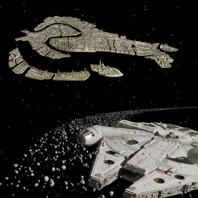

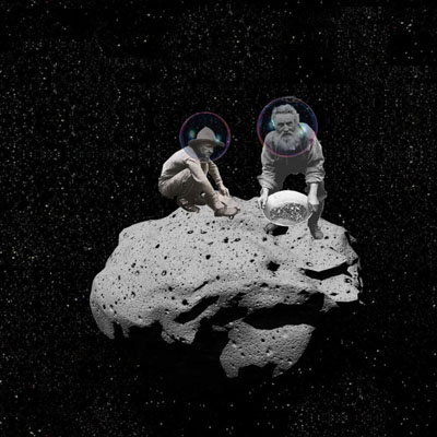
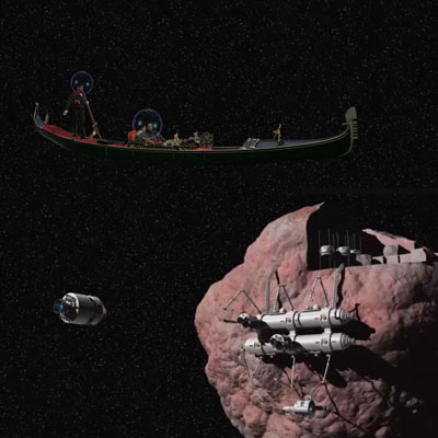
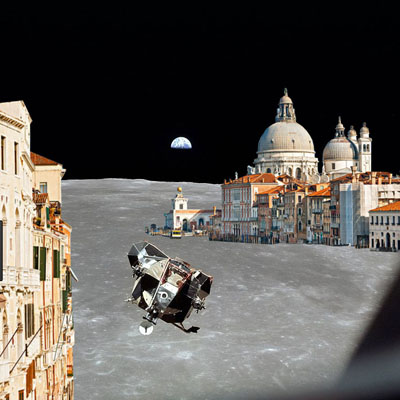
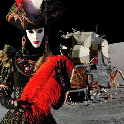
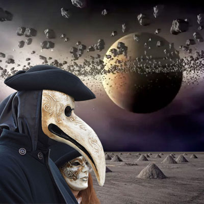
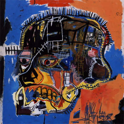
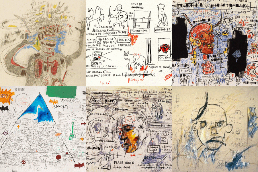
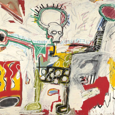


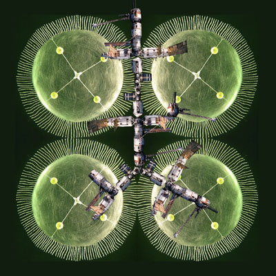
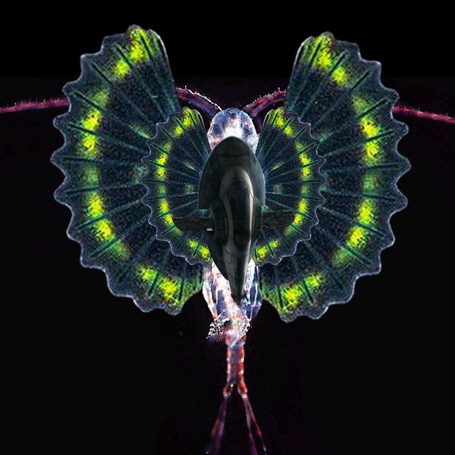
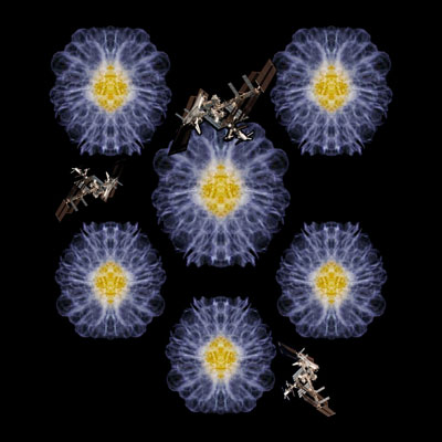
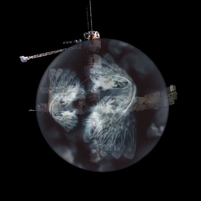
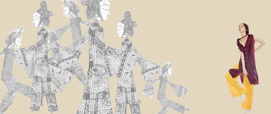
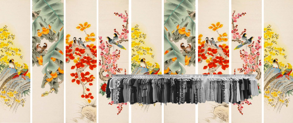

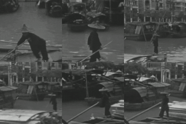
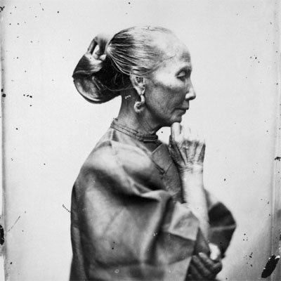
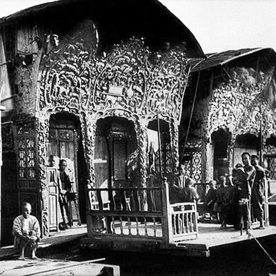
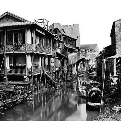
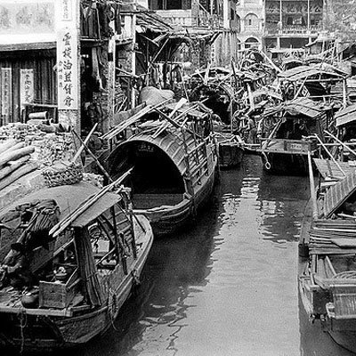

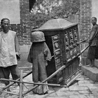
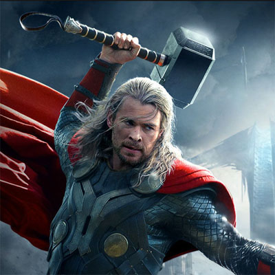


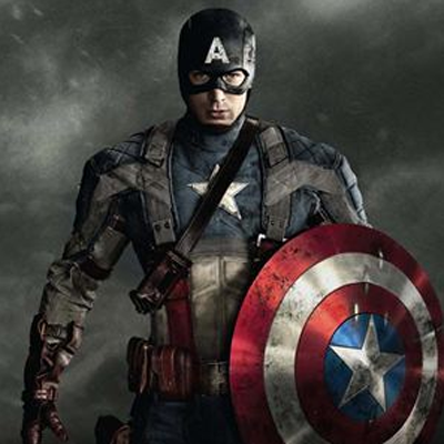


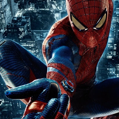
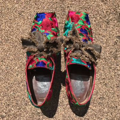

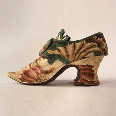
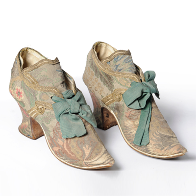
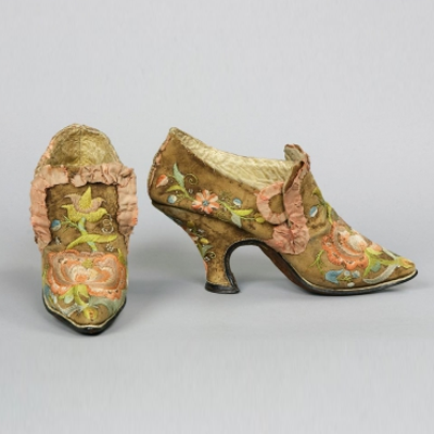
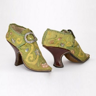
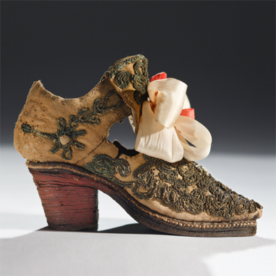
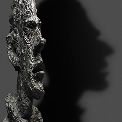
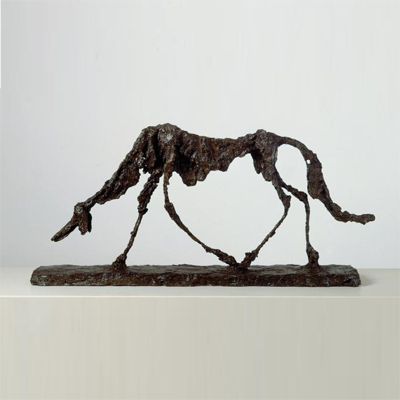
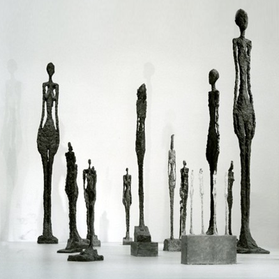
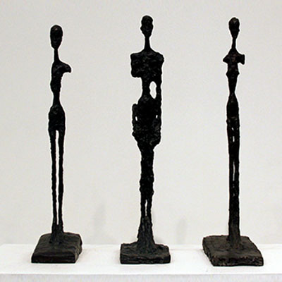
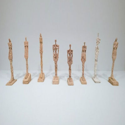
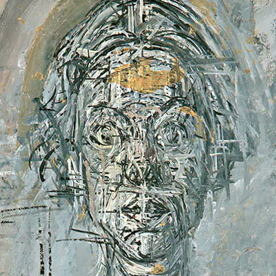
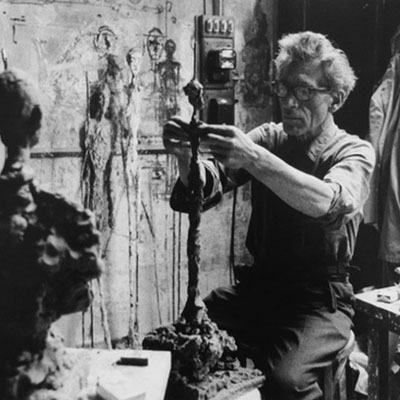

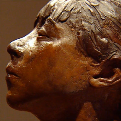
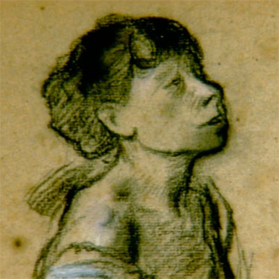
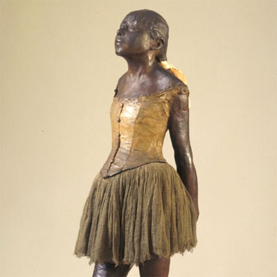
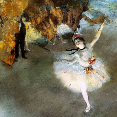

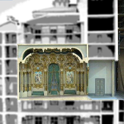

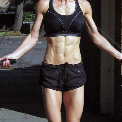
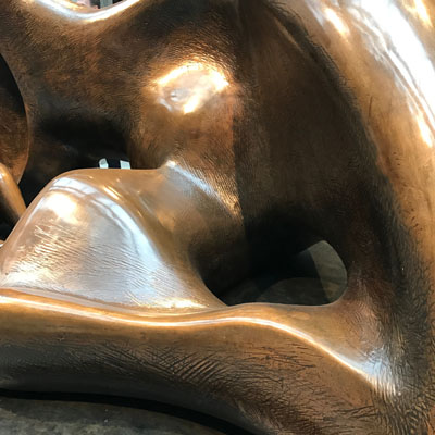
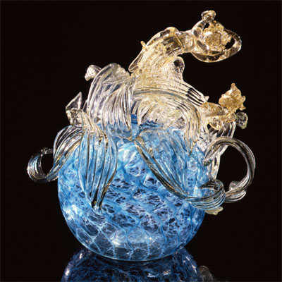

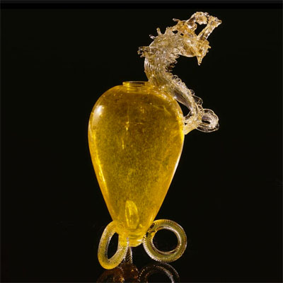
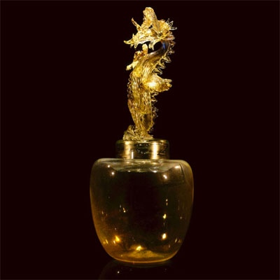
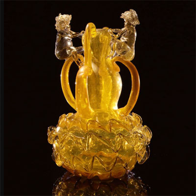
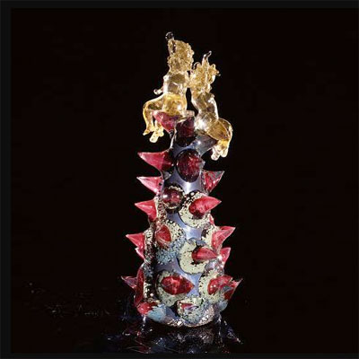
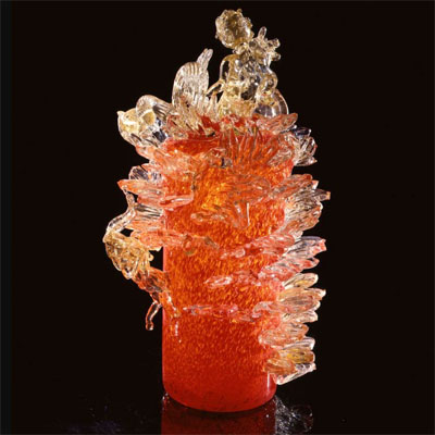
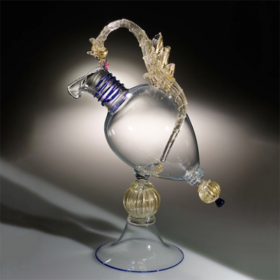
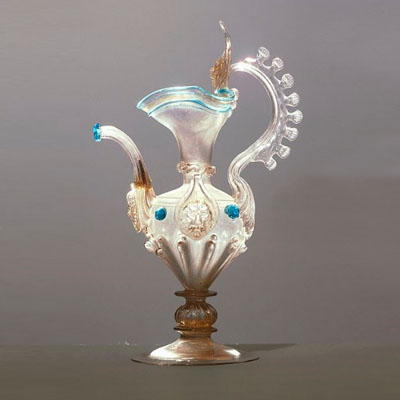
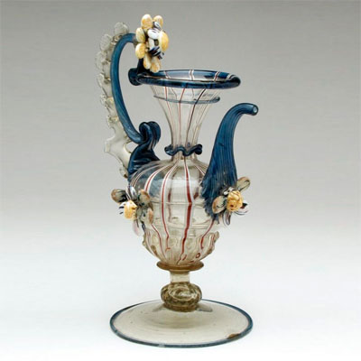
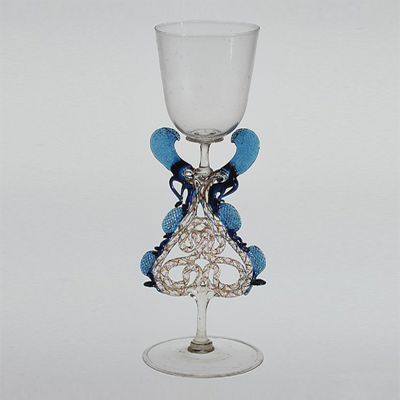
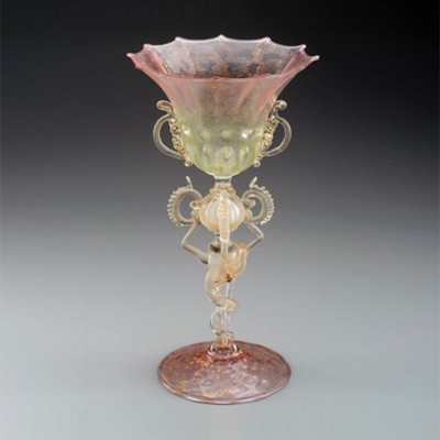
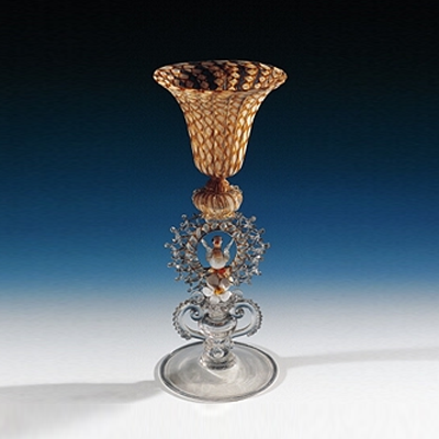


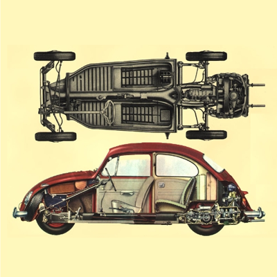
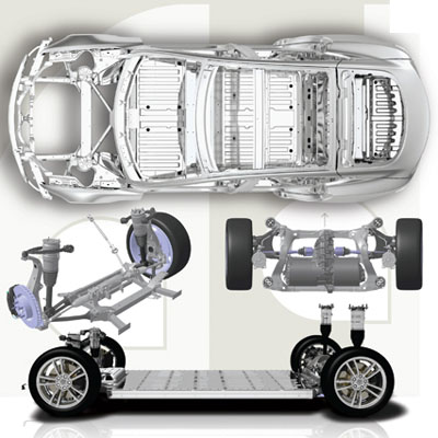
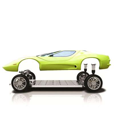
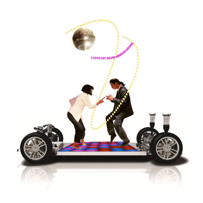
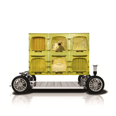
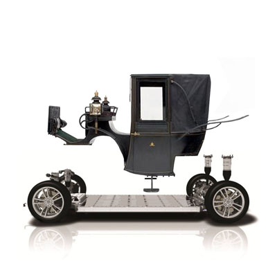
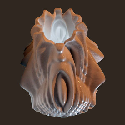
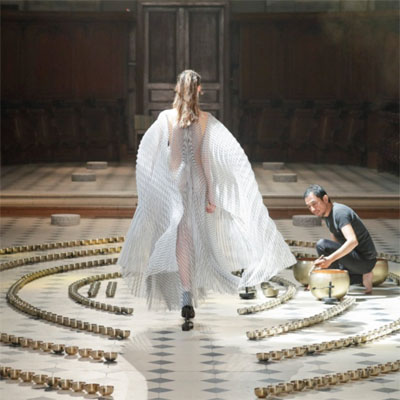
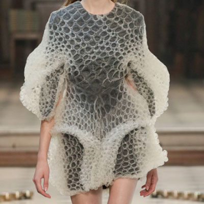
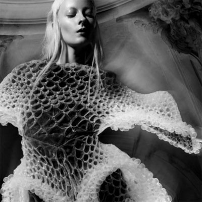
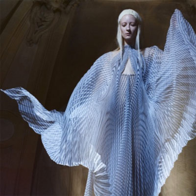
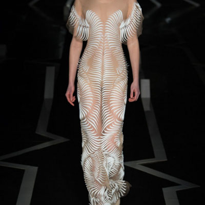
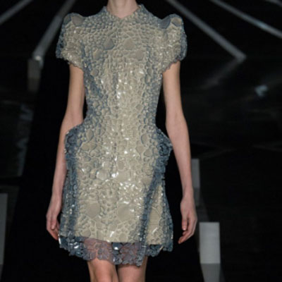
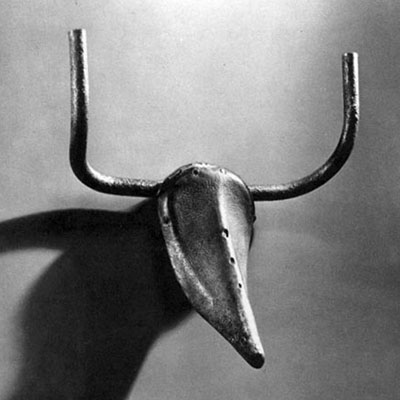
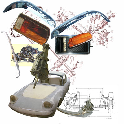
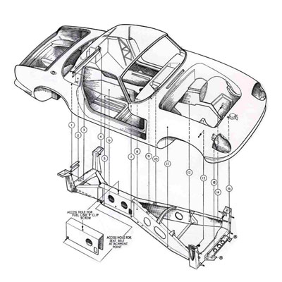
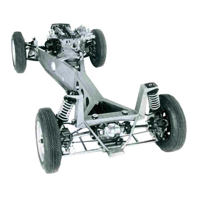
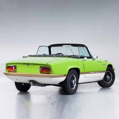
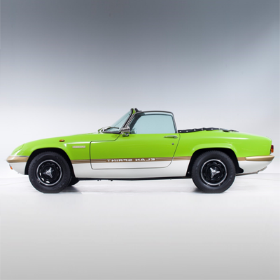
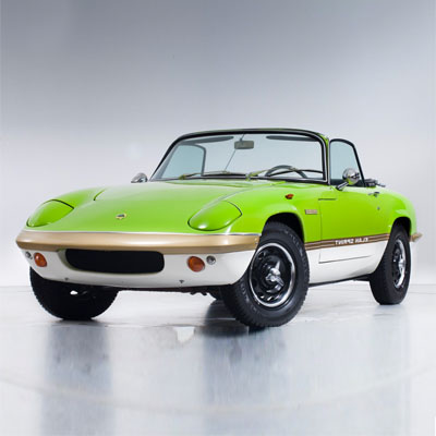
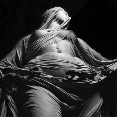
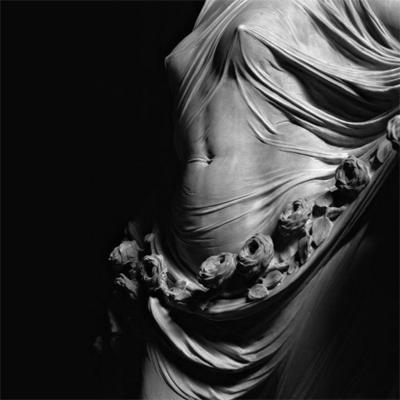
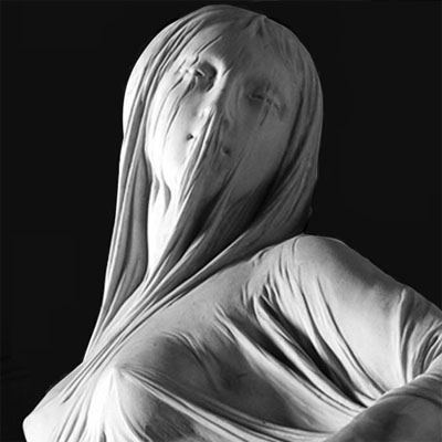
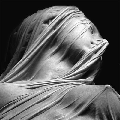
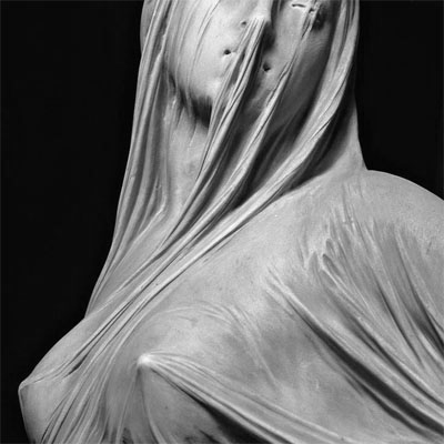

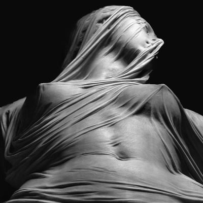
 copy.png)
