210616 – Zaha Hadid – V&A, London SW7
> words
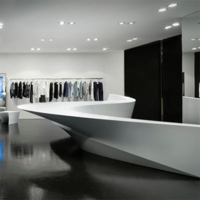
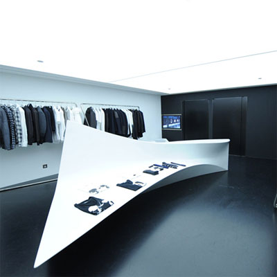
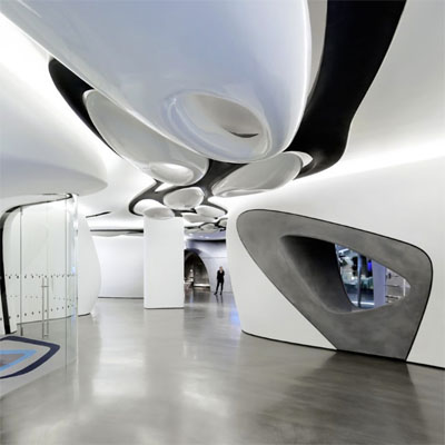
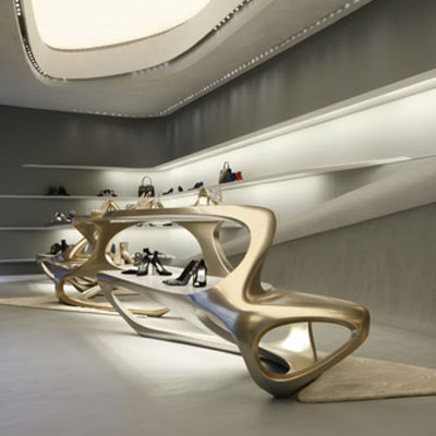
The crisp folds of the collars and cuffs of a well ironed white shirt were the inspiration for the Neil Barrett shirt shop in Tokyo. This concept delivered with such sculptural simplicity and clarity brought a wry and unquenchable smile to our faces, a smile that just kept returning. Kar-Hwa Ho, Head of Interior Architecture at Zaha Hadid Architects presents recent retail projects. Zaha Hadid’s studio must be one of the very few design studios that can deliver innovation, integrity and quality through a full range of scales from the bracelet to the city. In this presentation each interior is a clean box into which a sculptural display piece is inserted. The echo of influence from the central display to the rest of the shop follows like ripples around a pebble dropped in a stream. A totally fluid and liquid space is generated, the effect assisted by glossy floors and subtle lighting. When the container, the store, is kept rectilinear the sculptural pieces sliver through the space as if on their way to another destination. All so incredibly beautiful!
The Surrogate Twin
170616 – Biomimicry – V&A London, SW7
> words
Biomimicry the latest hyped trend does what many have previously tried to do utilise and learn from natures billions of years worth of R&D. So what is different this time around? The answer is thirty years worth of useable desktop computing. In the late eighties desktop computing became accessible, affordable and useable although they then had very limited CAD ability their power has increased exponentially over the last three decades. Information that was once the reserve of NASA or the military is available to all within a few clicks and new information is globally distributed from every bedroom or coffee bar laptop or ipad. Equally unprecedented is the intensity with which we are able to see. We have learnt new ways of seeing. We can look at the macro cosmological or micro intercellular, we can x-ray, gamma ray, infra-red and spectrum analyse. We can time delay photography over decades or nanoseconds speeding up or slowing down time and subject. At the same time access to information has, at last, allowed multi-disciplinary groups to form, expediting our transition from compartmented scientific studies to understanding systems and symbiotic synergies. The speed at which this transition has taken pace has been an exhilarating roller coaster ride sadly leaving many wrong footed or with displaced skills on route.
Today’s series of lectures ran from 2pm to 6pm. Talks by academics and practitioners on a range of implications and applications of biomimicry from the obvious to the incomprehensible. Our computers analyse and our robotic machines fabricate. There is a youthful optimism, a genuine excitement as new frontiers are opened and explored. Two things struck me from the talks, one to do with approach and methodology and the other to do with power and chronology.
One. Architecture use to be about problem solving; practising architects know how best to manipulate the rules. Light in relation to floor spans, distances between service cores, modulation of structural systems, thermal modelling, orientation and optimisation, procurement logistics – things like that. Cultural buildings, the ones architects love, have greater artistic license due to their inherent global semantic. Cultural buildings generally have large budgets justified by their symbolic and political agendas and not their pragmatic requirements but these architectures are still very much part of the problem solving approach.
The young architects presenting today do not problem solve as described above but instead edit. They edit algorithms that in turn control fabrication processes. At concept they have little idea of the purpose or form of their architectures. Form is generated through feedback, perhaps to a set of rules, abstract or otherwise but often simply edited by a strong aesthetic intuition to produce a scaleless landscape that can be occupied somewhere downstream during the design process. This approach may at first seem alienating but it has a long lineage of architectural precedent including the work of Cedric Price, Gordon Pask and John and Julia Frazer. In fact any system that is responsive and grows by accretion can be used as reference. Even cities, as these develop organically are generated by often abstract rules. Cities are occupied for purpose, how and when required and have a remarkable similarity to algorithmic generated form the difference is primarily scale, the length of the chronological evolution and the increased complexity of the editing criteria. The richness of the non-prescriptive algorithmic approach is, without doubt, its ability to generate new, previously unimaginable aesthetically intoxicating forms of exquisite complexity and beauty. Gordon Pask who once said “Whilst computer-aided architectural design is useful if repetition or standard transformations are required, it is inadequate to the task of producing new forms.” would be happily on his knees in disbelief. At numerous reviews within academia I have listened to a lot of ‘hot’ air and trawled through acres of equally ‘hot’ drawings all associated to the endless pursuit of new forms and the occupation of the residual consequence. Better critics than me have openly slept through whole presentations. But just as Gordon Pask, so understandably, missed the potential of computing we should remain optimistic that the residue will be occupied. That somewhere downstream, sense through reinterpretation or discovery will capitalise on this explorative pioneering.
Two. In ‘Skyfall’ Bond sits staring at Turner’s ‘The Fighting Temeraire’ oblivious to the ensuing parody that will follow. A spotty youth in the form of ‘Q’ sits alongside Bond and explains the melancholy that has been captured in oils. Q explains the inevitability of time and progress as the great three deck battleship is steam driven to dock to be broken up, now old and out dated.
Talented innovative youth is not a new phenomenon. Mozart, Borromini, Picasso, Pascal, Piaget and Ampére immediately come to mind along with the millions of innovative youths that never become famous. However today’s innovative youth with the help of social media and the Web have access to previously unimaginable influence. Ideas and personas are grown virally creating disruptive opportunities for those with little real world experience. Hopefully within this flux, where new ideas battle for longevity, natural filters will distinguish whom, which and what is relevant. The last two decades has witnessed start up CEO’s and their businesses valued at billions while they are still in their twenties. Businesses and influence of this stature would previously have taken multi generation companies decades to acquire. Handing the reigns to those so young, when their influence is global is an experiment in itself the consequence of which is for future historians to tell. But these are changing times and at a time when we need change and as an optimistic educationalist I can only say here are the reigns, now where are we going.
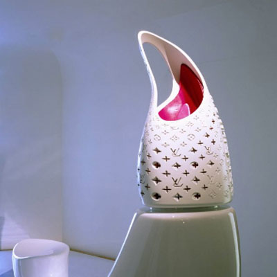
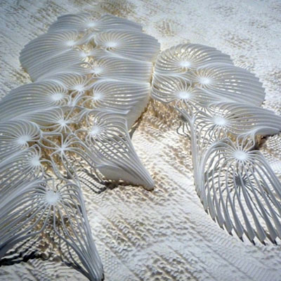
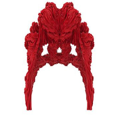
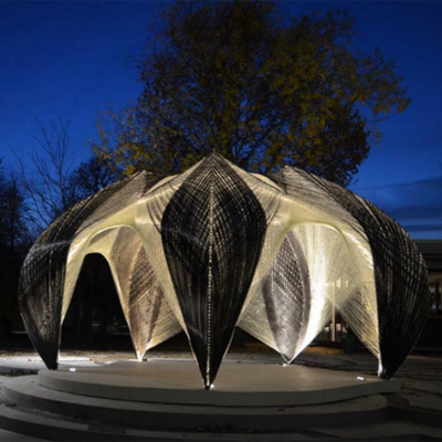
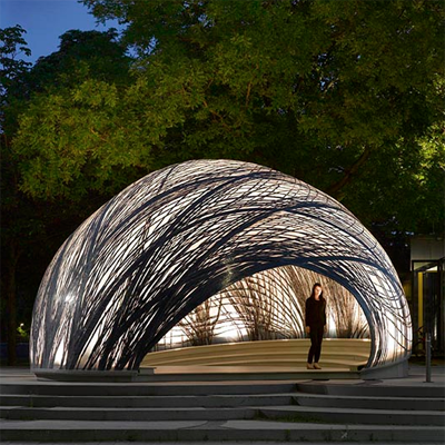
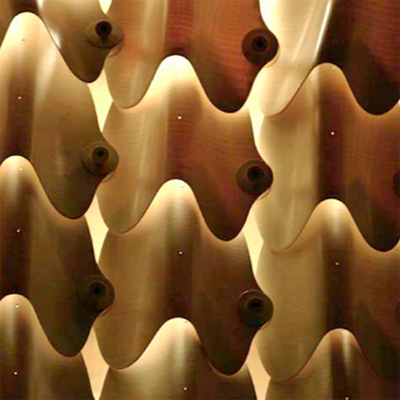
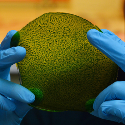
Images from left to right – Alisa Andrasek x2, Achin Menges x3, Julian Melchiorri, Michael Pawlyn.
The Surrogate Twin
150616 – Switch House – Tate Modern, London SE1
> words
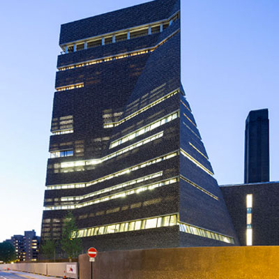
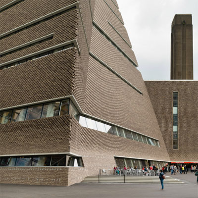
Joining the endless queue of Tate members for the preview of the new Switch House building by Herzog De Meuron I was aware that any kind of appraisal would be difficult. The galleries were rammed shoulder to shoulder with eager viewers crawling over each other to see the unseeable. From this position we produced our first opinion of the new galleries so with time this may change. This is an intuitive and contrarian view.
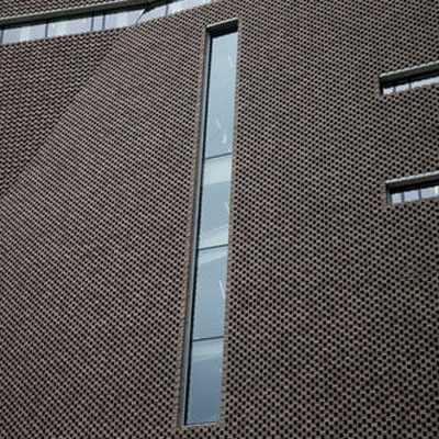
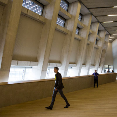
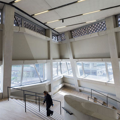
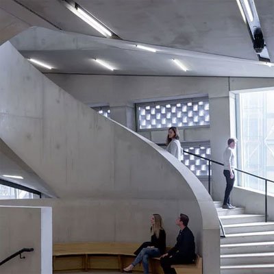
The Switch House has a strange initial feel, that of disjunction. The building has huge weight, a perverse introspection, a colossal structural cage combined with car park detailing. It doesn’t feel like a new build but instead like a conversion and a conversion with many twisted constraints. It is as if the architects first built a monument and were then forced to structure and inhabit it. It is like Gustave Eiffel’s Statue of Liberty where a smooth external skin hides a crude grid lattice of steelwork. One is aware that one is inside the other but the two never become a complementary totality. It is a film set in which architectural items may hang. In part this is driven by the lack of genius loci and is inevitable for a gallery that offers introspective spaces to view a collection of multi national decontextualized pieces.
There is little precedent for tower galleries. Typologically galleries tend to be wide low buildings, of sequential spaces that maximise light from above. The idea of a tower gallery is intriguing as there is a need to be creative with natural light coming from the side. This would usually be the type of problem that architects enjoy but not here at Switch House where natural light is ignored. A suite of sequential spaces that are artificially lit can be anywhere, they could be underground so why put them around the perimeter of a tower with potentially incredible views of the river and city? Why put the service cores central to the plan and emphasise their importance as the expected route of circulation? Why even in the café space do we sit with our backs to the view? None of this made any sense……and I usually like Herzog and De Meuron buildings. So here is what should have happened.
The service cores should be moved off centre towards the north façade, towards the river. Between the service cores and the north façade should be a zone of circulation and meeting spaces with cafes and viewing platforms on route. To the south of the service cores would be the internal galleries lit both artificially and naturally from the side. The galleries would be punctuated discreetly with vista points. In a pyramidal form where the façade retreats as it climbs and open circulation space along the façade would open up equally to the sky and views enhancing the sequence of movement from gallery to circulation and back to gallery. In summation we would climb the river and sky to return to the gallery.
It seems counter productive to write a critique of a building by setting up an agenda for another but here Herzog and De Meuron have so missed the potential of this site that reviewing it in situ seems nonsensical. Perhaps I am looking for a national gallery building and this is an extension to an existing gallery? Perhaps with time I will be able to look at this for what it is but for now why is it as it is and what were they thinking? None of it made sense. Herzog talk to me?
The Surrogate Twin
040616 – Infinity – Victoria Miro, London N1
> words
The concept of infinity sits uncomfortably in a scientific world that relies so intrinsically on its units of measure. Infinity is an abstract, a mathematical or philosophical concept. Scientifically the idea of an infinite continuum does not exist, as all that is real requires a resource that is ultimately finite. Reality is a resource that can be measured and quantified.
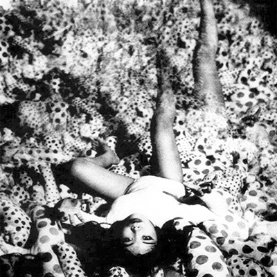
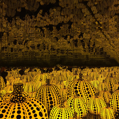
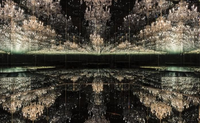
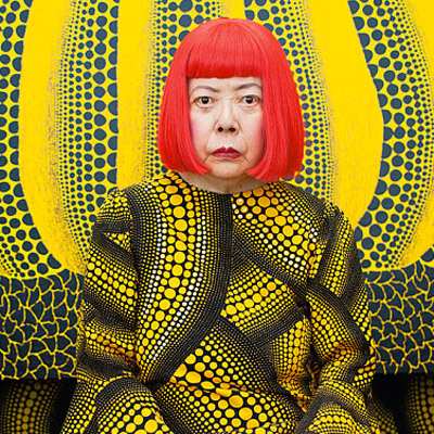
Infinity has been an obsession of Yayoi Kusama from her early works such as the ‘Infinity Net’ paintings of 1961 or the ‘Endless Love Room’ of 1965. This obsession continues in the recent installations at the Victoria Miro Gallery that pursue the concepts of a finite space enclosed by the boundless perimeter. The spaces created are solitary, peaceful, meditive, cosmological, ethereal, like the endless spaces created by Superstudio or the infinite white space of Space 2001. These spaces are deeply rooted in the culture of 1960s philosophical ideology and have an idealised physical and conceptual beauty.
The Koch Snowflake is a mathematical curve and one of the earliest constructs of fractal geometry. Its area converges and is therefor finite while its boundary diverges and is therefore infinite. A fixed area bounded by an infinite border or enclosure, a very Yayoi spatial conflict.
Lucy, from the film Lucy and the only person known to have accessed 100% of her cerebral cortex explains the paradox simply - “Humans consider themselves unique so they invented their theories of existence based on this belief of uniqueness. One is their unit of measure, it is the means by which we quantify all systems but our units of measure have been conceived to make the world comprehensible. We have quantified all systems to bring them down to a human scale, to make them comprehensible we have created a scale so that we can forget its unfathomable scale.”
Infinity is a circular system.
The Surrogate Twin
280516 – Missoni – Museum Of Fashion And Textiles, London SE1
> words
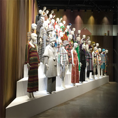
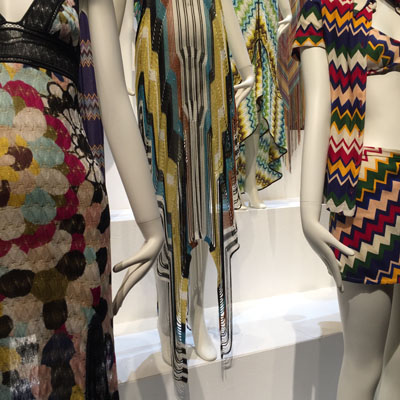
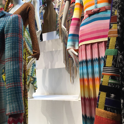
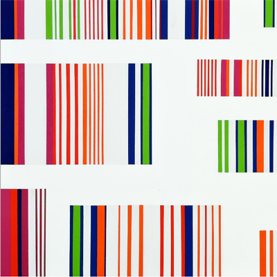
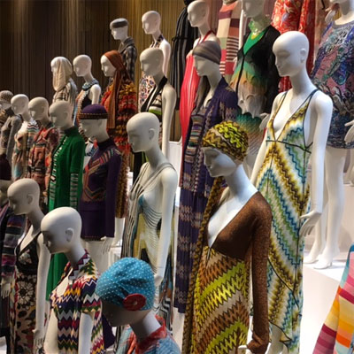
The Missoni exhibition at the Museum Of Fashion And Textiles is rooted in the 1970’s and in the Optical Art of the late 1960’s and early 1970’s. Colour, pattern, rhythm and technique are manipulated mathematically to form psychedelic patterns that tease and confuse the eye. Colours rarely, if ever, blend and instead are juxtaposed as balanced opposites that follow rules of sequence and collation. This is a small exhibition but the 1970’s focus gives it considerable punch. Clear referencing to Op Art, Ottavio and Rosita Missoni’s own colour studies and the whole predominant mood of peace, love, optimism and exploration of the early 1970’s can be felt in every room. For those interested in contemporary art history the exhibition is a beautifully nostalgic piece. For those interested in fabrication technique there are few more rigorous than Missoni.
250516 – Gothic Beauty – London
> words
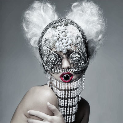
In Waldemar Januszczak’s The Dark Ages he describes the art of the barbarians and list among them the Vikings, Vandels, Huns, Moors, Celts and Goths. Waldemar rightly argues that their art was beautiful and inspired. Our own contemporary subculture of Goths has also inspired many designers of Couture to produce an exquisite dark beauty.
220516 – Refined Industrial – Newport Street Gallery, London
> words
Damien Hirst's Newport Street Gallery is an impressive building, part of which was once the artist’s studio but over time he has bought several adjoining buildings and joined them to make one gallery in which to display his personal collections. Damien Hirst self financed the gallery (£25m) pays for the running costs, provides the collections and lets the public in FREE. All anyone can say is WOW thank you Damien, much respect. The building by Caruso St John (of Gagosian fame) is an essay in understated refined industrial and consists of exquisite, beautiful spaces, minimal details and considered materials. The building alone, even from just the outside is well worth a visit.
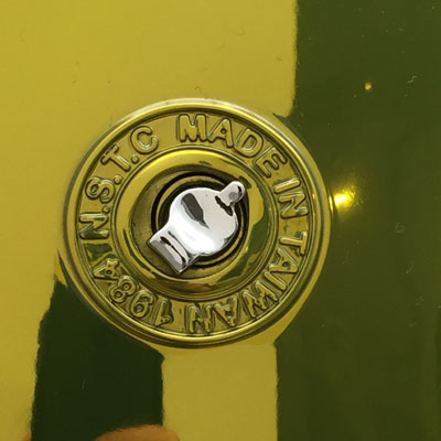
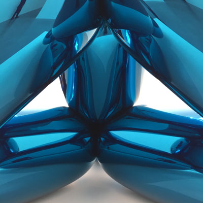
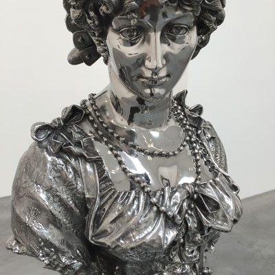
I have never had much time for contemporary art. I would tell my students that art stopped in the 1960’s with Robert Rauschenberg and nothing but marketing has existed since. This never went down well but much of what has been produced since seems without intellect or skill. There were always a few that have stood out, marketer extraordinaire Jeff Koons being one. Damien Hirst's personal collection of Jeff Koons’s work is on display at the Newport Street Gallery and a gem of a collection it is. Many of the works have been seen before but the production techniques used are still baffling. Arnold in Germany produces the cast aluminium and stainless steel pieces but give little technical information away.
Making copies of inflatables and plastic disposable items with such permanent and difficult materials and techniques re-evaluates the objects. A further re-evaluation comes from the presentation and The Gallery context and inevitably the cost and price of production and resale. To then make the cast aluminium piece look identical to the temporary inflatable piece right down to creases, faulty seams and sticker details is a perverse indulgence unique to the art world and wonderful it is too.
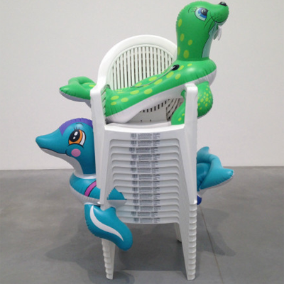
It is difficult to establish how ‘Seal Walrus (chairs)’ (image 3) was actually made but that’s all part of the illusion. Are they plastic or aluminium and can we sneak a touch when the heavy-handed security are not looking (no chance)? It was a shame that the balloon Monkey was not a Balloon Dog of the same scale as the space in which it was housed was like a huge kennel but the Balloon Monkey is an amazing piece that is guaranteed to make each visitor smile.
This is an exhibition and a gallery well worth seeing.
210516 – Foster Products – Aram Gallery, London WC2
> words
The Aram showroom at 110 Drury Lane has a small gallery on its upper level. On display through to 02.07.16 is some of the industrial design work of the Foster + Partners studio. In typical understatement the products on display were everything expected – extremely professional and as always, despite their aesthetic simplicity extremely complex. I have always admired Foster + Partners as they are the architectural equivalent of Apple, McLaren or Volkswagen. All these companies have an evolutionary approach to design where models are constantly developed and tested. Good ideas from previous designs roll over into future designs, being upgraded, made more efficient, elegant or production friendly on route. The Nomos table being a typical example where the 1981 table originally built for the Fosters own studio was a fairly crude adaptation of an existing drawing board, this is refined when used in the Renault building and refined again when mass produced by Tecno.
The show has a combination of early sketch models, working models, production stage models and finished pieces. The crudity of some of the early concept pieces and models lends us mere mortals hope when we next look at the first sketch of our latest project. Knowing that all ideas are first conceived on the back of an envelope as a sketch or a quickly made cardboard model and only with considerable work, skill and time do they develop into useable pieces of merit. The Foster industrial products on display are very much the resolve of teams of designers, each with a specialised input and the sophisticated concluding piece is an agglomeration of these inputs.
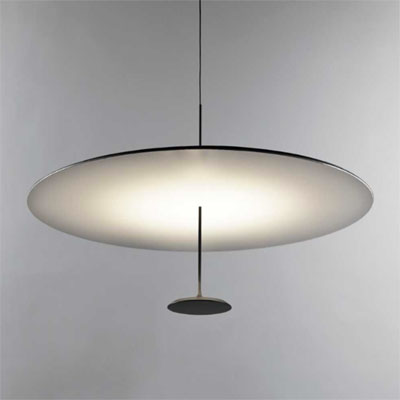
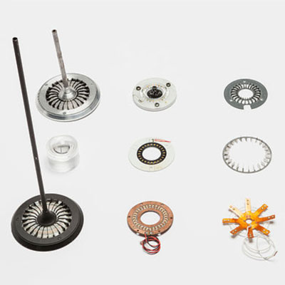
Some of the lighting pieces therefore are particularly complex. The Lumina Dot light a simple disc LED pendant lamp being one. LED’s give off a considerable amount of heat which is usually absorbed by a large heat sink. In Dot the LED’s are cooled by a fluid that runs through a tube connecting the lower LED disc to the heat sink in the larger reflector. The cooling fluid turns to vapour and transfers the heat to the heat sink. The vapour would then cool return to liquid and the cycle would continue. This in itself would be a beautiful diagram to see. Unfortunately there is little information at the exhibition and it takes the trained eye quite some time to work out what is going on. Why a product takes a certain form or how components were fabricated is what makes these exhibitions interesting and educational so please more information. Sadly students of design still naively believe that design is about inventing endless shapes and forms and increased design and production information at exhibitions such as this would help knowledge transfer.
It is an exhibition I will revisit as I still have too many unanswered whys? Why cast the heat sink? Why does any light product require so many parts? Why use Ductal concrete? Why cant we touch, feel the weight or texture of a material? The biggest why for me would be this - why does Foster + Partners find it so difficult to deliver organic forms and are happier with pure geometries. There are numerous talented students leaving the Bartlett each year that have an eye for soft complex computer derived geometries and many head straight to Fosters. Perhaps those at the top of the Foster hierarchy should loosen the reigns a little so that those in the office that are not yet associates may show what they can do?
150516 – Concept Art – Tate Britain, London
> words
Conceptual Art In Britain 1964 - 1979.
Art has often had to redefine its role in society. With the invention of photography the impressionists addressed this with conveyance of mood over pictorial representation. Between 1964 and 1979 Conceptual Art readdresses arts roll valuing process over product. The numerous pieces on display at the Conceptual Art exhibition at Tate Britain have little aesthetic value and are incomprehensible without pages of descriptive text. Art as a conclusive product becomes totally redundant and the process of making art, the idea behind the art is the art itself. This process is ephemeral, a passing event, the deliverance of an idea. When the idea becomes art, technique, skill and conclusion are secondary and this makes a lot of the early conceptual art less credible.
One of the questions raised by the conceptual artist is the value that the art establishment puts on the aesthetic. Representational art is first valued aesthetically. Is it beautiful? There is a philosophical dilemma in valuing art primarily on beauty. Should battles, war, famine and hardship be aesthetically beautiful? This was an apt question during the years of the Cold War, The Vietnam War and the student uprisings of the late 1960’s. An equally apt question is the purpose of the concluding art image in a time when TV, film and advertising begin to saturate and de-contextualise meaning in image. Historically Conceptual Art is pigeon holed into a narrow time frame but much of art produced today is conceptual. Scale, context, inversion, invasion, juxtaposition and repetition are common tools used in contemporary pieces and the early Conceptual Arts opened the doors to enable these investigations.
The Surrogate Twin
090516 – Glamour – London
> words
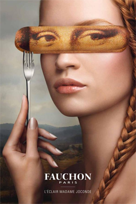
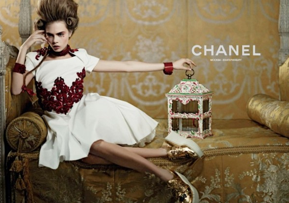
Oil painting celebrated private property. Ownership is measured in quantity and quality, vast landscapes of the country estate, elegant details of the jewellery collection, exquisite fabrics, rare porcelain and sculpture. The quality aspect of ownership puts emphasis on fine detail and from this the hyperreal super intense assemblage develops as a genre in which to indulge in excess. The viewer is to envy the excess as they are excluded from it. The digitally manipulated image continues this collation of detailed and elegant excess and uses it to advertise a lifestyle via desirables. The advertisement encourages envy but simultaneously offers hope as it sells the idea that lifestyle can be purchased through products. Lifestyle is sold on association so new products are juxtaposed against established lifestyle criteria. The hyper-real is tactile and touchable, being within reach is part of its selling power. The advert differs from the oil painting in one very important aspect. The oil painting reaffirms ownership; it is a picture of products, property, landscape already owned, an authentication of status. The advert promises a lifestyle if one could own. The advert has to first make the viewer dissatisfied with their existing lifestyle to encourage them to buy into the lifestyle promised. Adverts play on the anxiety that if you have nothing you will be nothing. The oil painting was a summation of wealth at a particular time and was therefore painted in the present tense as a record to be handed down to the next generation. The advert is always in the future tense, what could happen if you bought into the proposed lifestyle. Most people can rarely afford the whole lifestyle so they buy a symbol of it, the designer t-shirt or the signature sunglasses. Advertising aimed at the middle class does so by selling lifestyle combinations, complete outfits or complete interiors.
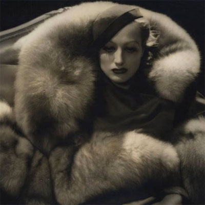
Glamour is a twentieth century invention and presents the enviable. To be enviable it has to be achievable and within reach. True beauty, genius and supreme talent are not envied as we appreciate their rarity and their genetic good fortune. These are not glamour. Glamour is envy added to the everyday.
Glamour’s true potency begins with the cinema of the 1930’s and is a twentieth century marketing invention. The exponential potential of dispersing media with the invention of film and television puts emphasis on the visual above all other characteristics. Glamour capitalises on the distribution and manipulation of the visual. The digitally enhanced image becomes the symbol and identity of the person. The person is assessed completely through the visual image. Markets are saturated by recurring images and these substantiate the ideas of glamour. The concept of glamour is most tenacious in urban conglomerations, in large cities, such as Paris, Rome, London and Los Angeles. Previously here the glamorous image could be quickly distributed. Today the concept of city has little relevance as glamour is propagated globally online. Glamour is international and tied to modern economies. It is a sellable commodity. As advertising develops, the visual image is increasingly used to provoke yearning for a lifestyle. As glamour is always advertised in the future tense, achievable through purchase, it is insatiable and enduring. Modern man exists within the contradiction of what he/she is and what he/she aspires to be. Advertising and glamour exploit this contradiction and this life of envy. Advertising gains credibility and longevity by bringing the unobtainable within reach only to offer the next desirable once reached.
Celebrity culture specialises in selling glamour, it packages the normal in a wrapper of envy. The viewer realises that the only difference between themselves and the glamorous is the wrapper. Today the glamorous are made over night they need no special talent other than being exposed to an audience. Reality programmes have taken the most banal and repackaged their product as celebrities. Marketing loves the celebrity, as they are able to capture a wide audience through a single character. The increased normality of the celebrity the greater the catchment potential for the marketing teams. Not too pretty, not too bright, not too talented the girl and boy next door all wrapped in glamour selling envy and desirability. As the marketing of glamour captures a forever widening audience with new mediums of distribution the subject of glamour reaches a new low. The greater the market-reach the lower the common denominator needed of the subject. Maximising market catchment becomes the driving force behind glamour. Glamour is an illusion. Glamour keeps the viewer at a distance and it needs that distance to maintain the illusion, this is why glamour works so well when distributed via the media.
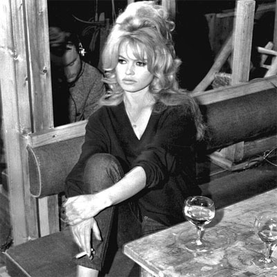
Glamour may have peaked during the 1950s and 1960s. At this time glamour and style were intrinsically linked and the marketing of it was personalised and limited enough to retain its credibility. Glamour today is mass produced, a factory product, a process through which each new prospective celebrity is churned. It uses a generic formula for what is glamorous and applies this to each individual, saturating the identity and qualities of the individual. Numerous talent shows have the ability to turn raw talent into tacky mediocrity via the glamour machine producing a poor derivative of the celebrity juror. The celebrity juror is often already a second or third generation derivative and this process is dilutive.
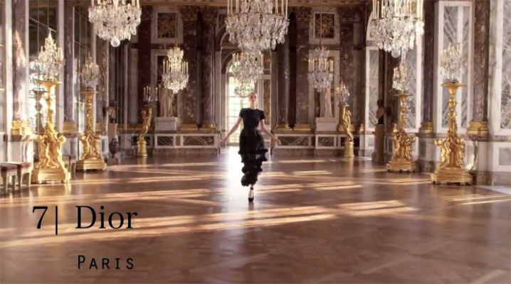
Glamour fortunately does still exist where the individual is in full control of the marketing machine. Glamour provides the platform for experiments in excess, where designers can explore the limits of luxury and the conventions of etiquette. The recurring red carpet events of the Twentieth and Twenty-First Century have become the substitute platform for The Royal Courts of the Seventeenth and Eighteenth Centuries and as such glamour has replaced pageantry.
The Surrogate Twin
050516 – Happy Yellow – London
> words
Creativity is problem solving and is associative, it takes what surrounds us and uses it in a novel way to resolve new questions. Creative people see unusual connections that others may miss when problem solving. The problem with being creative is that one needs outside substantiation to verify that ones own creativity is not insanity. Creatives work best as a team bouncing ideas one to the next. Constructive creative links differ from random associations and being able to edit constructive from random is the key to true creativity. The difficult part of creativity is rarely solving the problem, it is recognising a relevant problem to solve in the first place. One thinks of problems in terms of pragmatic issues, product development, infrastructure, logistics but problems can be social and cultural and these may also need creativity to resolve.
The impressionists faced a problem at the turn of the twentieth century. Art previously had a representational and allegorical role within society. With the development of improved literacy, accessibility to printed text and the invention of photography arts conventional role was disrupted and its previously exclusive minority elite market broadened. Science had shifted the focus from the mythological to the everyday and the wonders of the everyday were all encompassing waiting to be discovered by those that were able to see. The Impressionist painters took to this challenge by trying to capture the mood or experience of the moment instead of an accurate figurative representation.
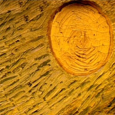
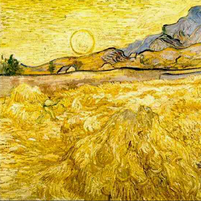
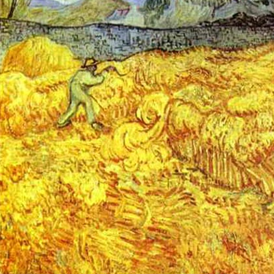
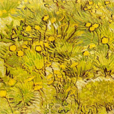
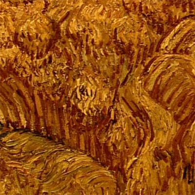
To Van Gogh a paintings feeling was its essence. Feeling is of course subjective but with Van Gogh capturing this feeling was a pursuit followed with a religious zeal. The feeling captures, sunlight, wind, heat, smell, sound, all of these things make up the experience of the moment and all are fleeting. The painters work is intense, quick, tactile, immersive and the result is the outcome of this outpouring. The canvas is not strategically composed, structured and balanced it is improvised on the spot, there and then. It is reactionary, and carries with it the mood of that moment, happy or sad, overwhelming or humble, hot or cold. When the canvas is finished the viewer should ‘feel’ the artists experience and in so doing share the moment with the painter. Feeling by definition is measured by intensity, the sensitive are the greater receptors of the atmospherics that set mood. Being sensitive and creative provides the perfect conduit for capturing this form of expression. Bias, emphasis, enhancement and magnification are part of the creative tools that help shift focus and reinterpret the feeling, enabling others to share and see. Van Gogh uses the medium of paint, with this medium he tries to capture the feeling of burning heat, of slow winds, of happiness. These are represented with intense colour and brush strokes that form an assemblage of micro foci. The viewer is drawn close to the canvass and sees the painting as the painter painted it. The viewer scans the canvas for areas of intensity and draws from it their own subjective conclusions.
Van Gogh as a creative, explores new ideas and means of representation and as such is isolated. There is no precedent by which to compare the results of his work. Success or failure depends on the acceptance and the interpretation of others. Associative thinking has no time for abstract society rules, all is equal and of equal measure and are part of the same alchemic mix. The creative that explores the unexplored walks a lonely path and in so doing questions the limits of their own creativity. During the creative process there is a continued dialogue between constructive and random associations and the artist is both editor and director. Van Gogh, like many creatives, had a personality of extremes, he was depressive, schizophrenic, bipolar. Exploring these emotional extremes enables access and interpretation of and to the creative tools of expression. To be creative one needs to question accepted norms and conventions but this experimentation needs affirmation through outside critique. When isolated logic is self-substantiating. For Van Gogh happiness was best represented by the colour yellow this is seen in many of his paintings. Yellow is a subjective representation of happiness but to Van Gogh eventually happiness and yellow become one and the same. Van Gogh concludes that to be happy the cure for his depression was to eat yellow. Potassium cobaltinitrite, Cobalt Yellow unfortunately for Van Gogh is a toxic cure for happiness. In the spectrum between what is normal and insane, between creativity and madness, one walks a dangerously narrow path but without those that question the limits of what is understood the world would stagnate.
The Surrogate Twin
280416 – Angry Light – London
> words
Rough and ready to brawl, rejecting the idealised compositions of the Renaissance Caravaggio painted up close and personal. He painted what was there, disease, decay and dirt all squashed into a flattened and compressed picture plane. Lighting flashing angry diagonals across the canvas, orchestrating the eye and unfolding the narrative, all set upon a darkened background. Caravaggio painted the light of the basement, the dive bar, the back street brothel, the light of the alley, intense one directional, splitting. Light that lands on his subjects like thrown fire burning patches from the canvas. The spaces are shifty, shady, squalid, the inhabitants dubious and suspicious. This was the Rome that Caravaggio occupied in the late 16th century. Doublet’s, daggers and dueling, ready to fight over a misplaced smirk or a poorly directed comment. Life day by day, hand to mouth, fight by fight, in the back streets of Rome, the underworld far removed from the Renaissance Papal elite. Supreme talent wrapped in a rough outer case.
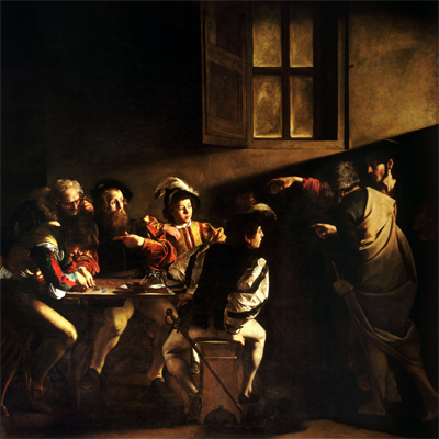
Caravaggio’s personal representations convert the mythological to the everyday pulling flying disciples off of the Papal ceilings to sit them on bar stools around an empty table in a lowly tavern. In The Calling Of Saint Mathew the prosaic is interrupted by the miraculous but to most of the bystanders of the composition the event goes unnoticed. Jesus and Peter enter the tavern barefoot wearing period contemporary clothes. Jesus points an accusing finger at Mathew. Mathew could be the bearded male third from left but the composition has more potency if he is the young male fiddling with the coins on the far left.
The magic of the painting is in the lighting; here tenebrism is used with deliberate mystery. Light is used in two ways. An upper window top right sets up a diagonal across the painting and this aids the narrative by giving it direction. A second light source falls on aspects of the characters, their faces and gestures. This second light is the one of interest as its source is unclear. Some of the light is frontal, some low as it illuminates under the table and some comes from the right, possibly from an open door through which Jesus and Peter entered. The light from the upper right window is above the majority of people in the composition. The light from the assumed open door (off frame) would need to travel through Jesus and Peter to hit the table. Jesus and Peter throw no shadow. Any frontal light, which is the most probable direction for light to be able to hit all five figures to the left of the composition gathered around a table, is shadowed on the left. This second light is used to split the composition into two groups. The group around the table sit in a sphere of multi directional light and as such are illuminated. Jesus and Peter stand in a more natural light that falls on their backs and obeys most scientific laws. The brilliantly lit hand of Peter, seconding the motion of Jesus’s hand, being the exception and is unnaturally lit. There is a dark chasm that divides the two groups in the composition. Into this dark chasm are the pointing accusing hands and here they float as an offering, a salvation. The picture could be read as a tripartite with a dialogue between two groups across a dark void and as such is symbolic.
Light adds a super-real element to the painting increasing its intensity. It highlights and accentuates, focusing on aspects of the narrative to aid decryption. Light sets the scene by establishing the space, location and atmosphere in which the meeting takes place. Light aids the dynamic of the composition by setting up a diagonal to aid the reading of the narrative whilst it moves the eye across the canvas. Finally, light emphasises the spiritual through mystical illumination, it splits the two groups of the composition into deliverer and receiver.
The Surrogate Twin
260416 – Punk Sexuality – London
> words
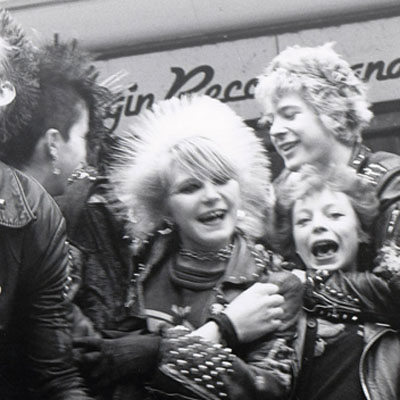
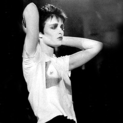
The UK of the 1970s was a complete mess. The working class, as always, react to oppression with invention. Cohesive society fractures and splinter groups form to establish areas of new art, identity and exploration. Some of these groups were retro and some new, some are positive and some negative. Skinheads, Teds, Rockabilly, Ska and Punks were all on the streets during this period. They had their own clubs, music and style of dress. At the time all of these may have seemed negative or without direction but with hindsight many positive things came out of this period of unrest. None was more positive than the achievements and legacy of female punks and this continues to enable and influence future generations. The punk movement encouraged complete self expression, neither talent nor tuition was a prerequisite and everybody was equal. This formed an unlikely platform for women, it was explorative, liberating and wild. The Roxy of the late 1970’s was a male dominated venue, it was aggressive, dangerous and intimidating and yet there were women there holding their own. I was in my mid teens when at the Roxy I recall how disturbed and confused I was about punk women. I found punk women incredibly attractive I had a primal lust for them but they terrified me. All of the signals were confused, public/private, inviting/defensive, attractive/repulsive, welcoming/opposing, aggressive/friendly male/female all of this in the chaotic cocktail of sweat and energy that was the Roxy set off sensory alerts that kept you on edge. It was an adrenaline junkies heaven. Punk women were aware of this male disorientation to their aggressive androgyny and explored its limits. It was, of course anarchic, it destabilised and confused, it was living performance art reassessing all conventional relationships. I can remember reading many years later a quote from Viv Albertine of The Slits “Guys didn’t know whether to fuck us or kill us” and although I’ve never wanted to kill anyone I knew exactly what she meant.
The counter culture of the punk scene encouraged women to participate on equal terms. If you could play get on stage. If the crowd approved they would dive into that bouncing scrum called a dance floor and you could continue playing. If the crowd disapproved they’d throw things at you until you left the stage, the same counteraction whether male or female. Punk enabled more women to form bands, play instruments and tour independently than in any previous music scene. Women pre-punk were often kept on the sidelines or added to a band for decorative affect. Previously there were many women front singers but now there were whole bands. The influence has continued as it is no longer unusual to see female guitarists or drummers. The role and the attitudes of Metal group L7 are indistinguishable from male Metal bands and this gender liberation owes a lot to the women of Punk.
For Punk the body was a political instrument, a symbol of opposition, of statement, of disgust for established conventions. It made the viewer question their own ideals on what is acceptable and gender presentation and identity featured strongly in this. Men dressed as women and women as men. Gender specific garments were adopted by the opposite sex. Hair, make up, piercing was all part of a genderless uniform. The conventional hierarchy and ordering of clothes was also questioned, everything that was normally hidden was brought to the front creating explicitly outward identities of sexuality. Further dress hierarchy was destructured as skirts were worn as tops, shirts worn back to front, clothes worn inside out. There was ripped multi layering, material and colour clashes, country tweeds with torn tights, suit jackets with metal studs and chains. Slogans adorned most surfaces and were no longer confined to T-shirts. The only rules were there were no rules. The body politic juxtaposed items of conventional clothing as a critique of their established roles and their use in society. Punk was an angry movement expressed through a masculine aggression. Women adopted an aesthetic of masculine aggression but pushed this further by using their bodies in the same way that men would. At the time Punk was not a deliberate intellectual movement but intuitive and responsive. In retrospect Punk was very much part of the Post Modern schism, a point of inflexion, questioning and redirection.
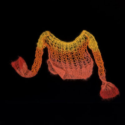
The influence of punk endures. Ten years after the Roxy I remember seeing a student at an art college, she was dressed in an orange Gaultier top, It had arms down to her knees and her arms came out at the elbows. The top was spray fit. She had a pair of Wolford electric blue tights on and had black steel toed hobnail boots, unlaced. On other days she would come to college in stripy pyjamas or an old ripped boiler suit that had no sides, you could see straight through from one side to the other and she rarely had much on underneath. When she left she would wrap up in a moth eaten fur coat, more living compost than garment. It was easy to read the legacy of punk simply from her outfits. Design houses had favoured it from Gallilano to Gaultier and quickly explored the new freedoms of aesthetic. Chanel was using graffiti?? Designer fashion pieces were now being mixed with found and altered items trawled from the second hand charity shops. Women were still questioning the conventions of beauty and appropriateness and aggressively staking their space. They would argue their case with a blind vengeance and defend their work until the critics became overwhelmed or defeated. The student in question was Lorraine but it could well have been many an art student of the 1980s of 90s. Once again I was overwhelmed with the irrationality of it all but reassured by the undiscovered potentials expressed though the medium of continued conversation that is progress.
The Surrogate Twin
170416 – Morphing the Body –V&A, London
> words
The Undressed exhibition at the V&A London.
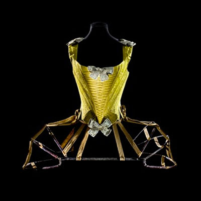
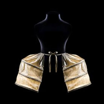
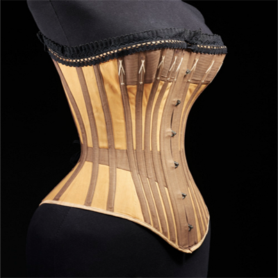
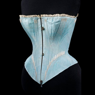
Morphing the body to an idealised form is a theme that runs throughout this exhibition. Waistlines move up and down the torso, bottoms expand and contract, sometimes sideways from the hips, sometimes rearward from the coccyx. Shoulders broaden, or are pulled back and dropped thrusting the chest skyward. Curves are enhanced, silhouettes revealed and the details extenuate the line. Form is idealised, across all periods there is a pursuit for the idealised form, that of the time. What many consider to be instruments of torture are also instruments of empowerment and this would seem to be historically consistent. The hour glass figure of Edwardian women determined the deportment that was required for women to enter the new mercantile nineteenth century society. The clothes of the 1960’s expressed a new sexual liberation and changing attitudes to ones role within society. Sexual expression and identity expression are two parts of a double-edged sword. Identity expression tends to be political and linked to prevailing ideologies whereas sexual expression is a subset within the present politic and is local and targeted.
What I found most interesting about the morphing of form, male and female was the move towards underwear as outerwear and developments in plastic surgery. Underwear as outerwear is suggestive, as much an invitation as an expression. Painters have used this throughout time as a means by which one is able to reveal ones true self. Also as a means of enticement drawing the viewer into the intimate space portrayed, women at their boudoir being a recurring theme with voyeur males in background. Underwear as outerwear in fashion today is slightly more crass but it also blurs the distinction of the role of each garment and these roles may well be an antiquated legacy. Underwear as outerwear is also an expression of gender equality with what was previously hidden and private becoming public. Historically society has been male dominated primarily due to the males physical strength. In times when physical power has less and less currency we may well see a gender role reversal. Underwear as outerwear can be political and intrusive as it invades the perceived personal space of others. Partly as an item that is usually associated with intimacy and is now being shared publicly sending out a confused signal. But also as a show of self-confidence that carries aggressive overtones with its disregard for convention and authority. With time any decontextualizing of the hierarchy of garments becomes normalised and any intended inherent message becomes diluted.
The second point of interest is the developments in plastic surgery and actual body enhancements. The hour glass figure of the nineteenth century encased in an exoskeleton of an idealised form slowly gives way to the more natural figure of the 1960s clothed in casual fabrics. Today nudity is commonplace on most beaches and has been normalised through printed and digital image. As it becomes more acceptable for the body to be seen in public (red carpet catwalks) it has become more important for the body to hold its own form. Men have exercised for millennium to obtain a perceived manly figure. This became more extreme with the body builders of the 1960s and 70s to the point of creating the unusable body. Women today spend many hours in the gym and are as self conscious about their chest, abs and butts as men. This requires a lot of time and hard work and beyond a certain age results are much harder to achieve. Plastic surgery offers both a shortcut to and an enhancement of the body beyond what may otherwise have been achievable. As the nineteenth century shaped the form of the body with the exoskeleton, the corset, the twenty-first century shapes form from within the body. Breast augmentation, gluteal implants, liposuction, rhinoplasty, otoplasty, blepharoplasty, rhytidectomy, abdominoplasty, rib removal, botox, tattoos, piercing (boob, butt, tummy, face, ear and nose jobs) are all common procedures. Some parts are cut away others are padded out with silicon sandwiched between the ribs and the skin. When discussed matter-of-factly it hardly seems normal behaviour and is much more of a radical intervention than trying to achieve a nineteenth century wasp waste. When augmented, the body requires special clothing to exhibit its new form. Clothing that can both reveal and enhance whether this is lycra and mesh or the sheer fabrics that dominate recent fashion trends. Today’s idealised form is heavily influenced by medias focus on popular culture. Cartoons and superheroes are satirical extrapolations that caricature human qualities, good and bad, weak and strong, masculine and feminine, beautiful and ugly, these set up a bipolar duality in which a narrative can be simplified. Popular culture maximises catchment using this simplified narrative. Popularity fuels a cultural feedback loop where humans that have been caricatured to exaggerate qualities to add emphasis for media become the icons for humans to emulate. The internally augmented form is a product of this emulation. At present the body is enhanced as an idealised natural form but how long will it be before bustles and panniers, or their modern equivalents, are inserted. Decorative silicon implants already adorn many faces of street cultured youths and asymmetrical forms may be the future norm.
In summation there has been an evolution from the natural body squeezed into the idealised form of the exoskeleton, through to a period of the natural body fitted in casual clothes, to a body augmented from within sheathed in a gossamer skin. As we move towards electronic tattoos, technological implants and responsive augmentation where programming and choreography may be as important as form manipulation. The morphing body may be able to respond to occasions or seasons or perhaps more immediately to the requirements of the next meeting or event. The clip from Terminator 3 immediately comes to mind, when Kristanna Loken looks at a Victoria Secrets billboard with the text ‘What is Sexy?’ and responds by inflating her breasts.
The Surrogate Twin
130416 – RooBot – London
> words
In September 1994 I began a lecture at UCL with two images shown side by side. One image was of a male body builder, his huge arms crossed in front of acres of chest. The other image was of a female ballet dancer standing on one pointe with her other leg reaching into the air way above her head. It was an introduction to a talk on ‘Extreme Climates and Responsive Systems’ and the analogy represented by the images was immediate. The body builder represented the machines of the Industrial Revolution and the ballet dancer the machines that we needed today. The ballet dancer was fuel efficient, had a high power to weight ratio, had uniform strength throughout a full range of movement, used biomechanics over brute force, had coordination and could interact with other complex movement patterns, could be choreographed to work as part of a complex integrated team, could adapt quickly to a range of landscapes and environments. More importantly the ballet dancer was female as Gaia is female and very much part of a circular system. Biomechanics and circular systems would be the inspiration for the next decades work on ever more delicate machines that responded to the harsher climates of our planet.
We jump forward twenty years and robots are at last coming to a department store near you. Robots have been a recurring Sci-Fi topic for hundreds of years from earliest automata’s of the Renaissance to early twentieth century films such as Metropolis. The 1950’s saw a new push for automated friends and assistants as American directors popularised science fiction with films such as Forbidden Planet and The Day The Earth Stood Still. Many visions of the future from these films had man and robot working together but the realities of reaching this goal have proved a little more difficult to resolve. The computing age has made vast strides forward in the development of robotics. The seamless link between hardware and software has until now been allusive. Many early robots were simply machines doing automated repetitive tasks. The next generation will be robots that can multi-task and make elementary decision upon those tasks i.e. how to pick things up, how much pressure to apply, how to balance, how and where to put things down, how quickly to move, how to avoid obstacles etc. The majority of funded research explores aspects of one or more of these tasks i.e. Boston Dynamics location based environmental sensors, balance and balance correction. Others such as Pepper and Erica explore the interface of man and machine with their emotive recognition and responsive robots.
A lot of these projects are still based on pattern recognition and the ability to churn through huge quantities of data instantaneously. We have come a long way since Alan Turing’s work but the majority of modern robots are still Turing machines albeit very sophisticated ones. AI will enable robots to learn and this will improve their ability to make decisions. In many ways this will still be data crunching and statistical analysis but all done at such speed that it would seem like a conscience decision expressed by a piece of hardware, the robot. The Tech firms are throwing huge budgets at this. Facebook recently set up Building 8 to work on hardware that can utilise its software and data harvested from its billions of users. As early simple products come to market the revenues generated will head straight back to the R&D departments for use on the next big project. The process will snowball and progress will be quick and its progression logarithmic. This is all happening now and the journey is well underway. Facebook’s ten-year roadmap may well be reached in six.
A kangaroo can travel huge distances with great economical efficiency at cruise speeds that average 20 kph (12 mph). Kangaroos can, when required reach speeds of up to 65 kph (40 mph). When travelling at speed the Kangaroos huge tail works as a whipping counterbalance to the head and body. This forms a pendulum motion over the hips where head and tail move up and down in unison helping to create lift. The Kangaroos rear legs have elasticated tendons that stretch from the back of the knee to the underside of the toe. The tendon is stretched over an exaggerated and lengthened heal. The tendon is an energy storage mechanism. It recycles the energy used upon landing and stores it in the elasticated tendon. The heal adds leverage to the storage system. Approximately 50% of kangaroos jump makes use of this recycled energy with the rear legs powerful muscles providing the remainder. A kangaroo increases its momentum not by increasing the speed at which its hops but instead by increasing the length of each stride. In this way, combined with its recycled energy, the kangaroo uses almost the same amount of energy at whatever speed it travels. This soft biomechanical motion is a fluid integration of total body movement and will be very difficult to replicate with a machine.
Festo is a multi national that makes hydraulic and pneumatic components for industry. Festo has an R&D department that uses its technologies to experiment with biomorphic machines. This R&D is mainly used as both training for its young engineers and marketing for its products and as such presents a conflict of interest between marketing and research. Machines here are made to resemble animals and they may have some attributes of that animal but resemblance dominates. For example the Bionic Kangaroo (their name, I’ll call it a RooBot) has the plastic body of a kangaroo with a plastic tail but it is a hopping machine. It could be a frog or it could be a fluffy white cloud. The RooBot like the kangaroo has an elastic tendon but this does not recycle energy as does the kangaroos, its energy is pre loaded by a standard pneumatic cylinder DNSU fed by a high pressure storage unit and a valve. The RooBot’s tail and head are plastic add-ons that do nothing other than suggest form. The RooBot can hop, it can turn and it can balance all very commendable achievements but this is not M.I.T. Media Labs. The RooBot is a sophisticated marketing toy posing as research and here is the dilemma. Although one is aware that marketing of existing products dominates the research into biomorphics Festo’s R&D has still produced some incredibly poetic pieces. The Air Mantra is an exquisite art piece and shoals of them ‘swim’ the galleries of the world. The Festo engineers have produced other mechanical fish that have the same mesmerising beauty and the RooBot suggests very similar potentials.
So what is the point of this meandering text? The film Blade Runner (adapted from Philip K Dick’s Do Androids Dream Of Electronic Sheep) was set in Los Angeles 2019, three years from now. So somehow within the next three years we have to move on from the RooBot to the Nexus 6 perfect Replicant, unlikely indeed. However, what all these pieces do is reaffirm just how incredible and unique the biological perfection that exists on our planet is and how much we have to learn from all nature that surround us.
If I had wish for one superpower it would be for immortality just to be able to watch this fantastic journey unfold.
The Surrogate Twin
110416 – Memphis – Milan, Italy
> words
I am writing this as my wife heads off to Milan for the annual furniture fare. She will be staying in Vivienne’s flat above the Westwood store in Corsa Venezia; lucky her. She leaves me at home to struggle on, failing to do all those things she does so well. It seems like almost a lifetime since I was last in Milan. When I was there I was a different person, with a different mindset and a different body, in fact I was another person altogether so unlike the person I am now. I was the existential nihilist, The Outsider, searching out other Outsiders with whom to work. So I can now use the excuse of Lorraine’s trip to Milan to recollect on my time there so many decades ago.
In the summer of 1983 I did the poor man’s version of the European Grand Tour. Fresh out of University and armed with a 1971 mini van that would be both my home and transport for the next few months I toured the architectural Greats of Europe to eventually end at my destination - the front door of Via Borgonuovo 9, Milan. I had come to work for Ettore Sottsass, he had no idea I was coming, no idea who I was and I didn’t speak Italian. My plan was simple, I would knock on the door, ask for a job and start work the same day. Only a student could come up with a plan like that. I was completely broke and camping at Monza. I had been introduced to the work of Sottsass by Penny Sparke and had written a dissertation on his work that was well received, from this I believed I knew Ettore. All I had to do was knock and he would say welcome, great to see you, we’ve been waiting for you, your desk is over there, the whole process shouldn’t take more than a few minutes. OK, so it wasn’t a same day start but I soon would work in the Sottsass studio at Via Borgonuovo, 9 and continue working there throughout 1983 and 1984. During this period I would also be fortunate enough to assist with the work of Studio Alchimia. I was exactly where I wanted to be exactly when I wanted to be there. My punk teens had drifted into the melancholy of Joy Division and Echo and the Bunnymen whilst at University. The world had problems. The 1970’s and 80’s I knew had little to do with the efficiencies of slick modernism. Working in a trendy High Tech London office would have been like drowning in corporate antiseptic. I’m sure I even had an allergy to the lime green studded rubber floors used in these offices that reeked of hospital and institution. So to Milan it was and to the Masters of Counter Design or Anti-Design. I was going to be happy anywhere that undermined the autocracy of Functionalism, hello Milan, hello Memphis.
At the same time, although young I was no fool, I was aware even then, that Memphis and Alchimia were not solutions they were merely reactions. They grabbed the dislocated complacency of modernism by the shoulders and gave it a good shake. A shake it well needed. Post Modernism was confusion, a search for the next direction. It was a confusing time to be a thinking student in any of the creative arts. Post Modernism was wise enough to see the many faults in the existing established systems but not wise enough to propose answers. We had entered the information age where we were bombarded by connectivity, symbiosis, numerous interrelated associations and yet the tools we had to decipher these were based on a Victorian scientific approach of compartmentation and analysis. The tools we had were inadequate, they were too slow and inflexible. The creatives that did well explored aspects of the complexity, structuralism, formalism, semantics, typology, regionalism etc. Three decades on and this work is still on-going. We still live in a time of flux, perhaps we always will, perhaps there was never, and never has been, any clarity or cohesion across capital, politics, sociology and technology. One system is always out in front waiting for the others to catch up, there is always imbalance and perhaps this is progress. Memphis in its own way was an aggressive agitator an ‘up yours’ to the status quo. It played with Kitsch, with the discarded, cheap laminates, bad junctions, clashing patterns and garish colours. It explored unusable items, it gave them characters, humour and personality. It questioned established taste with a ‘why not’ approach and the media that were at first abhorrent soon were enthusiastically supportive. Milan was the place to be and the basement floor of the Sottsass Studio was where the work was done. There were between 16-20 of us working side by side on anything from architecture through to fashion. At my desk I had fashion on my right and graphics on my left, one Hong Kong Chinese and the other Japanese. I was working mainly on furniture and products. The studio was multi cultural. The workforce had travelled from all over the planet to be there. All languages were spoken but the collective language, luckily for me, was English. Studios like this did not exist in England, fashion, furniture, industrial design, interior design, architecture and graphics were all mix up. Everyone had dead lines and as they approached we would all assist on each other’s projects, so as an architect I may be asked to assist on a graphic or fashion project. It was a rich environment to be in.
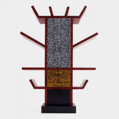
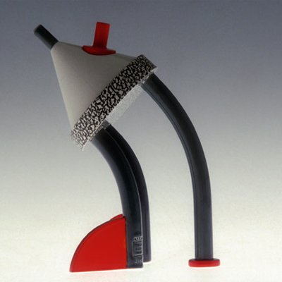
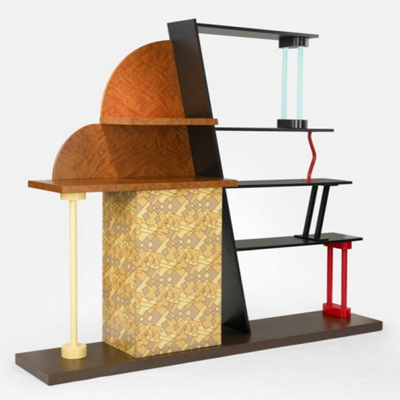
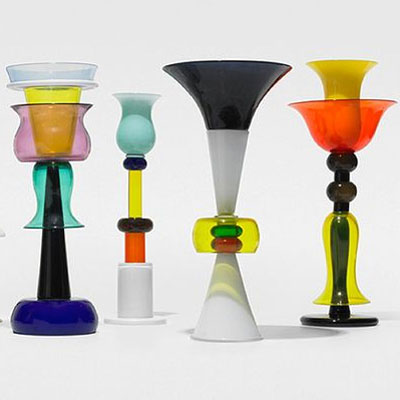
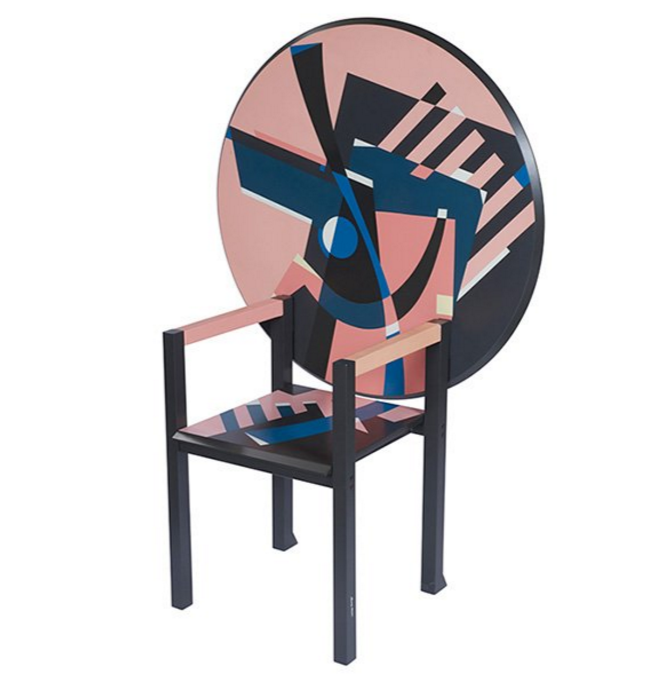
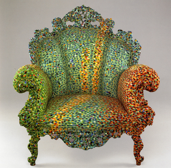
One of the reasons that I had queue jumped and managed to get a job at Sottsass was that they had recently undertaken a lot of work in America. The American architect in the office was soon to be leaving and they needed someone who understood feet and inches. I was English, that’s like American they concurred or at least more American than European and the English had once used imperial measurements so I was their man. When asked if I could fluently convert decimal to imperial the answer was a resounding “of course, yes”, I wanted the job. If I’d been asked to courier their work via jet pack I would have said “no problem, we have these at home” and somehow found time to read the manual before my first flight. So I am working on a large private house in LA and some showrooms across the US all in feet and inches. The drawings that I was sending out people were going to build from. I had no way of telling my new employer that the UK had dropped the imperial measuring system long before I had reached secondary school. So I am thinking in metric and then swapping all the dimensions to imperial, the process was slow. As one dead line approached I can remember screaming at the American architect “what retarded developed country still uses feet and inches anyway”. He was not impressed, he stared me straight in the eye and said “we took a man on the moon in feet and inches” touché, so once put in my place I never complained again. The architecture was architecture, crazy but still architecture. There was lots of industrial and retail work but the most enjoyable was product and furniture. It was all so spontaneous. A sketch would be developed to a set of crude working drawings, refined by a 1.5 model, a further set of 1.1 drawings produced and the piece would be made. The whole process might take only a couple of days. The studio was crammed full of maquettes, half finished models of projects, projects that had been shelved, projects that were picked up and restarted, or chopped up and used as part of another project. Ideas bounced around the studio as quick as new ideas could be formed. So it was highly probable that someone would be finishing your idea before you had finished it yourself. It was a wonderful chaotic, productive madness and the work the studio produced was beautiful, relevant and very influential. The work of Studio Alchimia, although more craft based, was as equally important in changing attitudes towards what design could be. Memphis and Alchimia reintroduced mannerism, character, humour, the tactile, the sensorial and the referential back into design. This opened a way for others to follow increasing the richness and vocabulary across a whole range of mediums for generations to come. It was a good time to be in Milan and here are some of my favourite pieces from that period.
Images 1-5 Memphis, 6-7 Studio Alchimia
The Surrogate Twin
120416 – Textures – Salone del Mobile, Milan
> words
I am in Milan from 12th to 15th of April for the Salone del Mobile and other events including the Vivienne Westwood in store reception. I did the Nike 5k run of Milan whilst here just to better tour the city. Images are of various textures from the Salone del Mobile.
100416 – Affirmation – National Gallery, London
> words
100416 – Affirmation – National Gallery, London
Amsterdam had entered its Golden Age by the 1600’s with control over the East Indies Trade, a period that would last for two centuries. Capitol moved from previously Spanish dominated merchants to the Dutch trading ports. Spain’s power had been diminished by lengthy wars with England. Europe was split Catholic/Protestant with the Catholics moving south as the Protestants moved North. Amsterdam attracted skilled tradesmen from a mixture of Protestant, Portuguese Jewish and French Huguenots escaping the persecuted Catholic countries and the Counter Reformation. Good infrastructure from canals and cheap energy from windmills and peat added to the growth. The Dutch East India Company, the first multi-national corporation dominated Asian trade and the spice routes bringing goods back to Holland before redistribution. On this Amsterdam was the convenient bottleneck for all this newly created liquidity. Science had also helped loosen the grips of the Catholic church and the individual began to enter a period of artistic self expression where previously all high art was religious. Modern sophisticated banking, finance and insurance grew to support the ever-growing trade. Trade was financed by shares sold on the first modern Stock Exchange and with this risk was diversified to the numerous shareholders. Speculation was rife driving up prices, Tulip Mania famously crashing in 1637. The Dutch also dominated Inter European trade via control of the Rhine. The Rhine entered the sea via Dutch ports and shipped goods in a two-way trade North/South from the Mediterranean countries to the Baltics. The Urban merchant class dominated Dutch society, with landed gentry and clergy having little influence. Calvinism established a liberal intellectual and religious tolerance and from this the sciences flourished as they were allowed the freedom to speculate and posture.
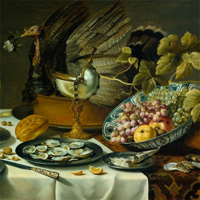
So what did the Dutch spend their newfound wealth on? One could say self-affirmation, all of Europe had been dominated by the Church and predestined thought. There was a cultural and intellectual fight to break away from divine fate and to establish a realm for the scientific liberal, to establish the individual. The big “Who am I” was answered by identity and status consumables - or portraits and possessions. Showy wealth was frowned upon as a Catholic attribute. Lineage, earthly and heavenly, best exemplified by Louis XIV of the House of Bourbon as the Sun God with his ‘Divine Right of Kings’. A common problem when religion and law become one. Puritan reality replaces idolatry. Painters such as Vermeer and Rembrandt (portraits), Osias Bert and Snyder (Food), van Brussel and Bosschaert (flowers) expressed this. The ideal and Divine, Gods on clouds, the celestial vision, is replaced with dark backgrounds that focus the viewer on more humble subjects such as portraits, food and flowers. Each of these genres were very much used as an expression of wealth however humble the compositions may look today.
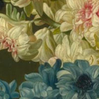
So here we are looking at paintings of flowers but trying to look through the eyes of wealthy 17th century Dutch merchants. When a Tulip bulb could sell for 10 times the annual salary of a skilled craftsman and as expensive as pepper (peperduur) was a common expression. All things shipped in from new found far foreign lands had huge value due to the related risks entailed in transportation and acquisition, spices and exotic flowers being no exception. So in many ways this is the equivalent of Dutch 17th century bling but in a language that today lacks relevant punch when the contemporary audience that has been exposed to the abundance of modern supermarkets or are blind due to the proliferation of the disposable digital image. One could retro-read a beautiful painting of exquisitely detailed flowers as representative of 200 years tyranny, power struggles and corruption but that would be a lengthy essay, perhaps for another day. Today we’ll just enjoy the skill of the artisans that could capture sunlight striking a shell, a petal or the iridescence on a fly’s wing.
The Surrogate Twin
080416 – Icon – London
> words
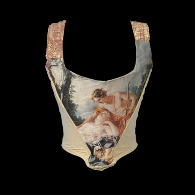
What better way to celebrate Vivienne Westwood’s 75th birthday than with some iconic pieces from the her archive.
Happy Birthday Vivienne. Lx


